unsupervised_learning_with_feo
- 1. What is Unsupervised Learning?
- 2. Choosing the Optimal Number of Clusters
- 3. k-means Clustering
- 4. k-medoids Clustering
- 5. Hierarchical Clustering
- 6. Density Based Clustering
- 7. Cluster Validation
- 8. Principle Component Analysis
- Exercises

1. What is Unsupervised Learning?
Imagine navigating through an infinite sea of data, where texts, images, numbers, and more converge in a wild stream. This rich source of the digital age harbors true value deep within, though it may not be apparent at first glance. It’s like charting a course on a map in a vast ocean of uncharted data, similar to sailing through uncharted waters with no prior knowledge. This is where unsupervised learning comes into play.
Unsupervised learning is the art of uncovering the hidden secrets within the world of data. Instead of being guided by labeled examples, unsupervised learning algorithms delve into the depths of the data ocean to reveal underlying structures, relationships, and patterns. It’s like giving a machine a magnifying glass and letting it discover its own patterns and connections.
At the core of unsupervised learning are two main concepts: clustering and dimensionality reduction. Clustering involves grouping observations in a dataset based on their similarities. Think of it as organizing a new bookshelf you’ve just acquired. You know you need to put the books from your desk and the tables around the house into it, but how do you determine where each book goes on the shelf, and what order they should be in? The books by authors like Asimov and Herbert, who write science fiction, can be grouped together due to their similarity. On the other hand, authors like Joyce and Camus, who are considered classics, can be put in a separate cluster. In essence, you’ve created two clusters: classic literature and science fiction books. This clustering technique, like the one I’ve mentioned, is incredibly useful in various fields, from customer segmentation in marketing to identifying subtypes of diseases in healthcare.
Dimensionality reduction, on the other hand, involves simplifying complex data by reducing the number of features or dimensions. Imagine a detailed picture; dimensionality reduction helps create a simpler, abstract representation that preserves the essence of the original. It’s important to remember that every task we assign to machines comes with a cost, just like a task at work or a school assignment. Tasks that are simpler require less time, effort, and potentially much more. Dimensionality reduction accomplishes exactly that. A reduced dataset allows the machine to work with less strain and lower costs. Plus, it’s not just about the cost; it’s also about the possibilities. Data visualization is limited to three dimensions. Beyond that, visualizing datasets with more variables is impossible. However, if you reduce a 15-variable dataset to two variables, it becomes visually representable. Taking all these aspects into account, dimensionality reduction acts as the benevolent algorithm wizard, saving us from the curse of high dimensionality.
In the rest of this book, we’ll explore various clustering algorithms and learn how Principal Component Analysis (PCA), a dimensionality reduction technique, works. We’ll see how it’s calculated step by step and how to implement it in R and Python. You can also test and reinforce what you’ve learned with the exercises at the end of the book. Keep in mind that machine learning is like an iceberg; teaching is what’s visible, learning is the hidden part of the iceberg. If you don’t practice what you’ve learned with various datasets, you’ll essentially learn nothing. Considering all of this, I hope this book will be beneficial for you.
2. Choosing the Optimal Number of Clusters
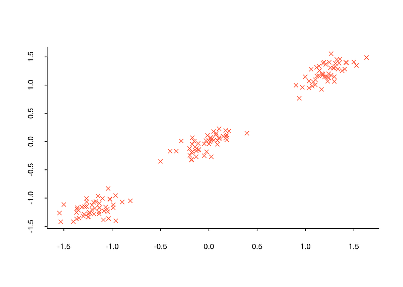
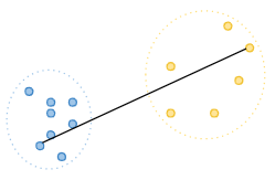
When encountering a title like this, you might wonder why determining the number of clusters is important. Let’s recall the example of the bookshelf from the previous section. We separated the books in the bookshelf into two clusters: classic literature and science fiction books. However, how did we decide that there were only two clusters? Can we be truly certain that two clusters are the correct number? In fact, the example was manageable because we only had six books. What if we had a million books to deal with? Determining the number of clusters can be feasible in some cases but challenging in others. Visualizing this with a dataset can be enlightening. For example, when you look at the distribution graph below, you can determine that there are three clusters because observations are concentrated around three distinct points.
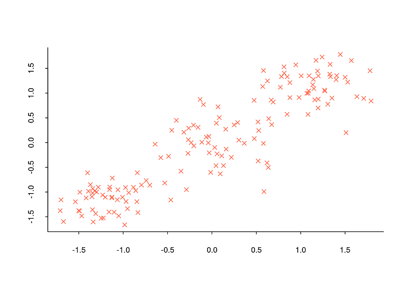
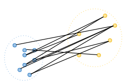
However, determining the number of clusters in commonly encountered datasets is often too complex to be achieved solely by observing the general structure of the data with a distribution graph. For instance, when examining the distribution graph below, it will be quite challenging to determine how many clusters the dataset is divided into.
Since such problems are constantly encountered, a number of methods have been developed for the task of determining the number of clusters. In the rest of this section we will see what six of the most used methods are, how they are calculated step by step and how they are implemented in R. In all of examples given, same data set (Breast Cancer Wisconsin) is used.
2.1. Elbow Method
Elbow method is a technique used to determine the optimal number of clusters in a cluster analysis. The idea behind it is to run clustering algorithm on the dataset for a set number of clusters (k) and calculate the sum of squared distances (SSE) of each point to the nearest center for each value of k. The elbow point is the point at which the change in the SSE starts to flatten out in the plot of the SSE versus k, indicating that adding more clusters does not improve the model much. [1], [2]
Elbow method can be calculated with the following steps:
-
Determine the number of clusters, usually between 1 and 10 but can vary depending on the analysis.
-
Run the desired clustering algorithm for each k value and calculate SSE for each k value.
-
A line graph is drawn with each k value on the x-axis and the SSE values on the y-axis.
-
The point where the SSE starts to decrease at a slower rate is the elbow point and the corresponding number of clusters is the optimal value for k.
Undoubtedly, Elbow method is one of the most widely used methods. However, it would be wrong to say that it gives good results under all circumstances. Sometimes it can even be said to be misleading. For this reason, it should be emphasized that the Elbow Method should be used to determine the number of clusters in every cluster analysis; however, it should not be relied on this method alone.
In R, factoextra packages offers fancy plots for some of methods to
determine optimal number of clusters in this post. I will use
fviz_nbclust function to visualize elbow method for data set.
fviz_nbclust(df, # data
             kmeans, # clustering algorithm
             nstart = 25, # if centers is a number, how many random sets should be chosen?(default is 25)
             iter.max = 200, #  maximum number of iterations allowed.
             method = "wss") # elbow method
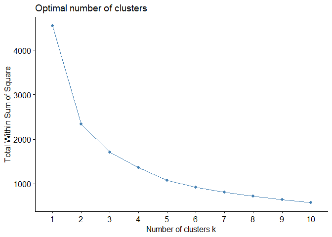
For example, output above shows that there is no sharp elbow. For this reason, it draws attention as a result open to interpretation. An interpretation based on this elbow may therefore lead to incorrect results.
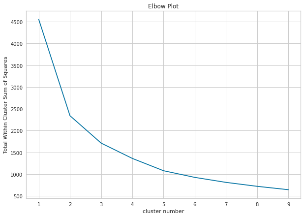
In Python, we can draw elbow plot using sklearn.cluster and matplotlib.pyplot.
import matplotlib.pyplot as plt
from sklearn.cluster import KMeans

Sum_of_squared_distances = []
K = range(1,10)

# for loop to calculate Total Within Cluster Sum of Squares for each clustering result in the given range.
for num_clusters in K :
 kmeans = KMeans(n_clusters=num_clusters, n_init=25)
 kmeans.fit(pcadf)
 Sum_of_squared_distances.append(kmeans.inertia_)

# drawing elbow plot
plt.figure(figsize=(10,7))
plt.plot(K,Sum_of_squared_distances, 'x-')
plt.xlabel('cluster number')
plt.ylabel('Total Within Cluster Sum of Squares')
plt.title('Elbow Plot')
plt.show()
2.2. Average Silhouette Method
Average silhouette method is a validity metric that measures how well a particular observation is defined within its cluster and how well it is separated from other clusters. It is calculated in three steps.
-
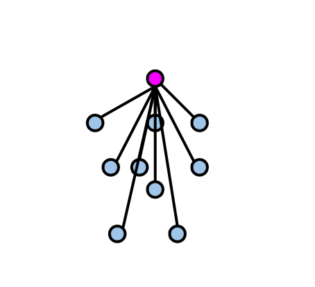
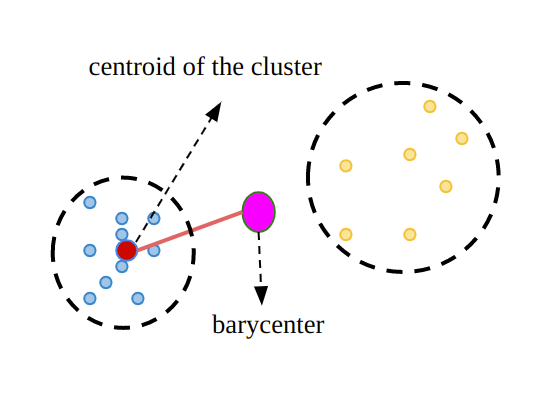
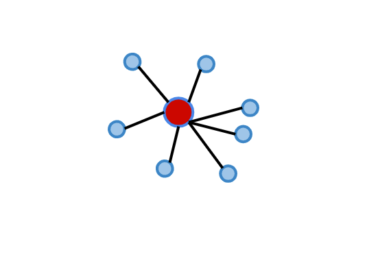
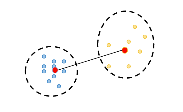
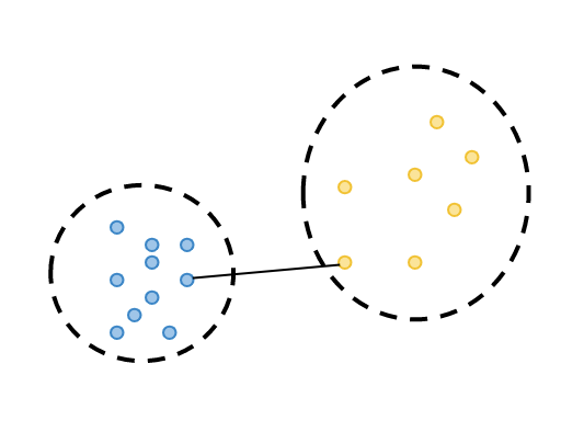
Cluster tightness is calculated: Silhouette coefficient is computed by dividing the total distance of the observation being evaluated (highlighted in purple in the diagram below) to the other elements of the cluster it belongs to, by the total number of observations. This metric can be denoted as a(i). (Euclidean distance metric is commonly preferred when calculating distances.)
-
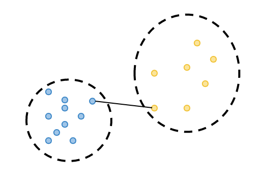
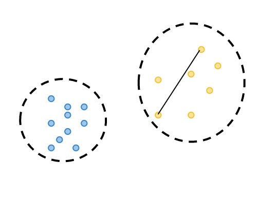
Cluster separation is calculated: the distance of the observation for which the silhouette coefficient is calculated to the least distant observation among the observations in the clusters to which it does not belong. We can call this metric b(i).
-
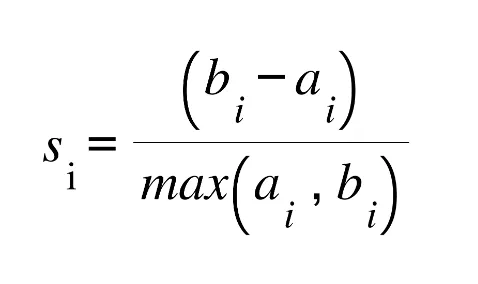
Silhouette coefficient is calculated: The silhouette coefficient is calculated by taking the difference of b(i) from a(i) and dividing by the higher value of b(i) and a(i).
With the above steps, Silhouette value is calculated for each observation in the dataset. By examining Silhouette coefficient for each observation, we can assess how successful the clustering is for each observation. The Silhouette coefficient, which takes values between -1 and 1, indicates that the closer the value is to 1, the more successful the clustering result is. However, let’s remember that our priority here is to determine the number of clusters.
To calculate validation of a clustering result, we can sum Silhouette values for all observations and divide it by the total number of observations in the dataset. Nevertheless, this approach contradicts our primary objective in this section. To determine the number of clusters, we can use Silhouette method by performing clustering for each number of clusters within a specific range (e.g., from 2 to 10), calculating Silhouette value for each clustering, and searching for the highest value.
Again fviz_nbclust function is a way to see average silhouette plot to
decide optimal number of clusters:
fviz_nbclust(df, # data
             kmeans, # clustering algorithm
             method = "silhouette") # silhouette
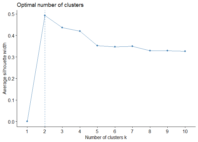
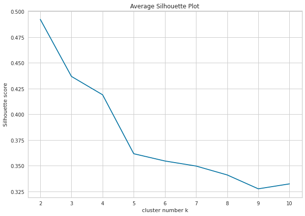
As can be easily seen from plot, clustering model with highest silhouette value is clustering for 2 clusters. Therefore, it can be inferred that optimal number of clusters is two. However, when silhouette values on y-axis are examined, silhouette value for number of clusters 3 is also quite close, although number of clusters 2 is highest. For this reason, it would be more useful to always run clustering algorithm for both 2 and 3 clusters and interpret results.
In Python, we can calculate average silhouette score of a given clustering result by using silhouette_score function from sklearn.metrics library. Similar with the elbow method, we can draw the plot using matplotlib:
from sklearn.metrics import silhouette_score

K = [2, 3, 4, 5, 6, 7, 8, 9, 10]
silhouette_avg = []
for num_clusters in K:

 # initialise kmeans
 km = KMeans(n_clusters=num_clusters, n_init=25)
 km.fit(pcadf)
 cluster_labels = km.labels_

 # silhouette score
 silhouette_avg.append(silhouette_score(pcadf, cluster_labels))

# drawing plot
plt.figure(figsize=(10,7))
plt.plot(K,silhouette_avg,'bx-')
plt.xlabel('cluster number k')
plt.ylabel('Silhouette score')
plt.title('Average Silhouette Plot')
plt.show()
2.3. Gap Statistic
Gap is a metric that measures cluster validity by comparing the observed within-cluster variance for different values of k with the expected variance under a null reference distribution of the data and is calculated in six different steps. [5]
-
A range of k values between 2 and 10 is usually chosen.
-
For each k value, the data set is clustered with the desired clustering algorithm and the intra-cluster variance is calculated.
-
Reference clusters are created by randomly sampling the original data and the intra-cluster variance of each cluster is calculated.
-
Gap Statistic value is obtained by taking the difference between the intracluster variance of the actual clusters and the intracluster variance of the reference clusters.
-
Gap Statistic value is calculated separately for each k value.
-
k value corresponding to the maximum Gap Statistic is the optimum number of clusters.
Again fviz_nbclust function is a way to see gap statistic plot to
decide optimal number of clusters:
fviz_nbclust(df,
             kmeans ,
             nstart = 25,
             method = "gap_stat")
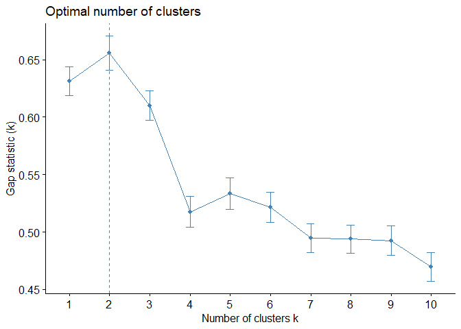
Just like Average Silhouette Method, Gap Statistic Method is also offered 2 as optimal number of clusters.
In Python, you can calculate DB using the following codes:
from sklearn.metrics import davies_bouldin_score

K = [2, 3, 4, 5, 6, 7, 8, 9, 10]
db = []
for num_clusters in K:

 # initialise kmeans
 kmeans = KMeans(n_clusters=num_clusters, n_init=25)
 kmeans.fit(pcadf)
 cluster_labels = kmeans.fit_predict(pcadf)

 # db calculation
 db.append(davies_bouldin_score(pcadf, cluster_labels))


plt.figure(figsize=(10,7))
plt.plot(K,db,'bx-')
plt.xlabel('cluster number k')
plt.ylabel('Davies Bouldin score')
plt.title('Davies Bouldin Plot')
plt.show()
2.4. Calinski-Harabasz Method
Calinski-Harabasz, also known as the Variance Ratio Criterion, is used for cluster validity and cluster number determination, just like other methods. The method, which can also be explained as a ratio of inter-cluster variance and intra-cluster variance, is calculated in three different steps[6].
-
For each cluster, the average distance to the cluster center of all observations in that cluster is calculated. It can also be called WCSS
-
For each cluster, the distance from the center of that cluster to the center of the dataset is calculated. We can call it BCSS.
-
Calinski-Harabasz coefficient is calculated for each cluster using the formula below.
where,
k: total cluster number,
n:total observation number
Calinski-Harabasz index takes values between 0 and infinity and a higher
value indicates a better clustering. For the Calinski - Harabasz method,
R does not have a visualization function like the methods I mentioned
earlier. Therefore, let’s write a function that calculates and
visualizes Calinski - Harabasz values for clusters between 2 and 10
using using calinhara function in fpc package.
library(fpc) # for calinhara function

fviz_ch <- function(data) {
  ch <- c()
  for (i in 2:10) {
    km <- kmeans(data, i) # perform clustering
    ch[i] <- calinhara(data, # data
                       km$cluster, # cluster assignments
                       cn=max(km$cluster) # total cluster number
                       )
  }
  ch <-ch[2:10]
  k <- 2:10
  plot(k, ch,xlab =  "Cluster number k",
       ylab = "Caliński - Harabasz Score",
       main = "Caliński - Harabasz Plot", cex.main=1,
       col = "dodgerblue1", cex = 0.9 ,
       lty=1 , type="o" , lwd=1, pch=4,
       bty = "l",
       las = 1, cex.axis = 0.8, tcl  = -0.2)
  abline(v=which(ch==max(ch)) + 1, lwd=1, col="red", lty="dashed")
}

fviz_ch(df)
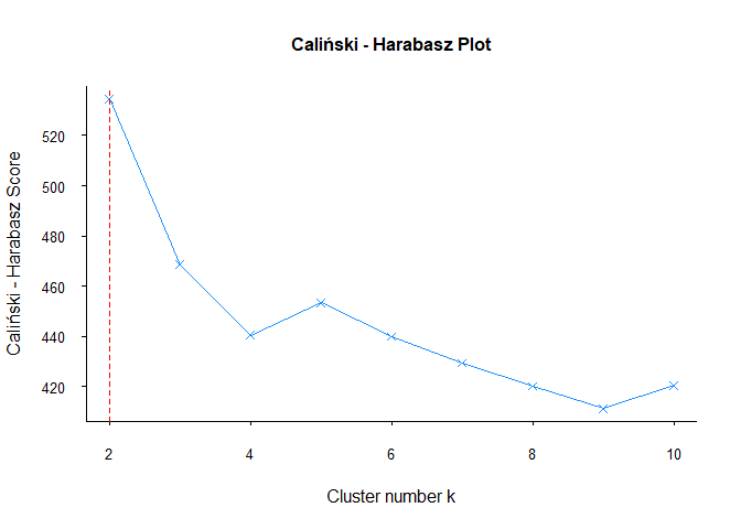
As other methods, Calinski — Harabasz methods is also offered 2 clusters for data set.
In Python, you can use the following codes for Calinksi-Harabasz calculation:
from sklearn.metrics import calinski_harabasz_score
calinski_harabasz_score(df, # dataset
                        kmeans2.labels_ # cluster assignments
                        )
2.5. Davies-Bouldin Method
Davies-Bouldin is a cluster validity and cluster number determination metric that measures the similarity between clusters[7]. It is calculated in three main steps as follows:
-
For each cluster, the average distance to the cluster center of all observations in that cluster is calculated.
-
Distance from the center of each cluster to the center of the other clusters is calculated.
-
For each cluster, the value that is most similar to itself, i.e. the minimum distance between the centers, is found. The sum of the values of these two clusters calculated in the first step is divided by the distance between the centers of these two clusters. Thus, the most similar cluster is found for each cluster. Then, these values of all clusters are summed and divided by the number of clusters to calculate the Davies-Bouldin coefficient of that clustering.
Davies-Bouldin index takes values between 0 and infinity, with a lower value indicating a better clustering. A value of 0 indicates that there is no similarity between any two clusters, while a higher value indicates a high level of similarity between some clusters.
Just like the Calinski-Harabasz method, there is no visualization
function in R for the Davies-Bouldin method. Therefore, let’s write a
function that calculates and visualizes the Davies Bouldin value for
clusters between 2 and 10 using NbClust function in NbClust package.
library(NbClust)

fviz_db <- function(data) {
  k <- c(2:10)
  nb <- NbClust(data, min.nc = 2, max.nc = 10, index = "db", method = "kmeans")
  db <- as.vector(nb$All.index)
  plot(k, db,xlab =  "Cluster number k",
       ylab = "Davies-Bouldin Score",
       main = "Davies-Bouldin Plot", cex.main=1,
       col = "dodgerblue1", cex = 0.9 ,
       lty=1 , type="o" , lwd=1, pch=4,
       bty = "l",
       las = 1, cex.axis = 0.8, tcl  = -0.2)
  abline(v=which(db==min(db)) + 1, lwd=1, col="red", lty="dashed")
}

fviz_db(df)
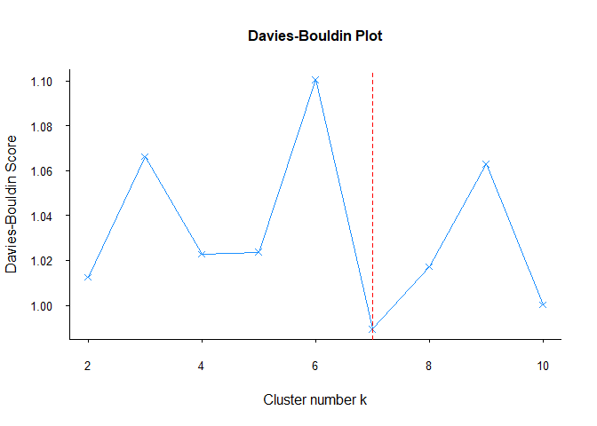
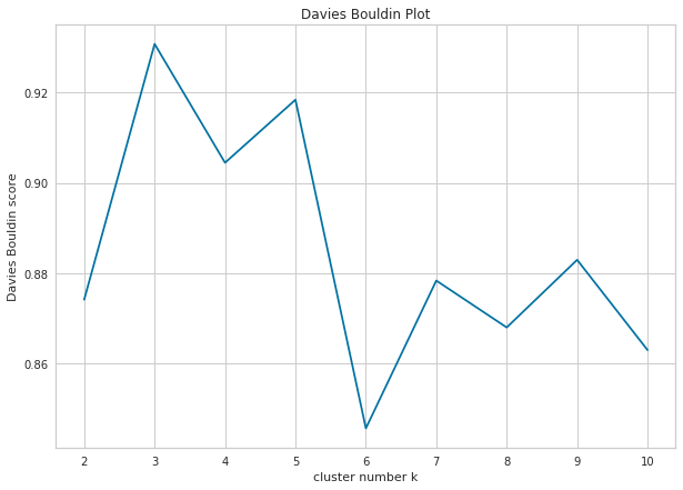
Unlike other methods, Davies-Bouldin’s recommendation for the number of clusters is 7. Although it gives different results in this data set, it may give more reliable results in other data sets. Therefore, it would be useful to include the Davies-Bouldin method in every clustering analysis.
2.6. Dunn Index
Dunn’s index is a measure of the compactness and separation of clusters in a cluster analysis [8] and is calculated in the following three steps: [8]
-
By calculating the differences between observations belonging to two different clusters, the closest observation in different clusters is calculated. This is called minimum separation.
-
By calculating the distance between observations in the same cluster, the distance between the two most distant observations is calculated and this is called the maximum diameter.
-
Dunn Index is calculated by dividing the minimum separation by the maximum diameter.
Dunn index ranges from 0 to infinity, with a higher value indicating a better clustering solution. A value of 1 indicates that clusters are perfectly separated and perfectly compact, while a low value indicates that clusters are either not separated or not compact.
Just like the Calinski-Harabasz and Davies-Bouldin methods, there is no
visualization function in R for the Dunn Index. Therefore, let’s write a
function that calculates and visualizes Dunn Index values for sets from
2 to 10 using dunn function in clValid package.
library(clValid)

fviz_dunn <- function(data) {
  k <- c(2:10)
  dunnin <- c()
  for (i in 2:10) {
    dunnin[i] <- dunn(distance = dist(data), clusters = kmeans(data, i)$cluster)
  }
  dunnin <- dunnin[2:10]
  plot(k, dunnin, xlab =  "Cluster number k",
       ylab = "Dunn Index",
       main = "Dunn Plot", cex.main=1,
       col = "dodgerblue1", cex = 0.9 ,
       lty=1 , type="o" , lwd=1, pch=4,
       bty = "l",
       las = 1, cex.axis = 0.8, tcl  = -0.2)
  abline(v=which(dunnin==max(dunnin)) + 1, lwd=1, col="red", lty="dashed")
}

fviz_dunn(df)
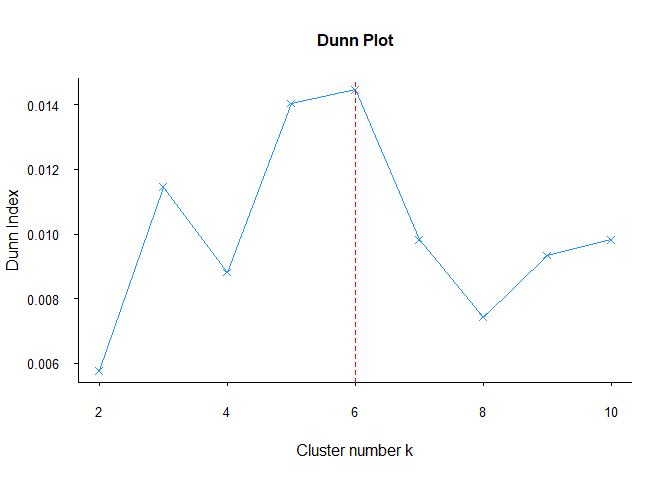
As Davies-Bouldin methods, Dunn also suggested different cluster number. As I said before, each method may give different results for each data set. For this reason, it is useful to compare all methods in each clustering analysis.
In Python, you can use dunn function from validclust library to calculate Dunn index as follows:
from sklearn.metrics import pairwise_distances
from validclust import dunn

dist = pairwise_distances(df) # pairwise distance calculation
dunn(dist, # distance matrix
     k_means(df, n_clusters=2).labels # clustering assignments
     )
References for Chapter
[1] Steinley, D., & Brusco, M. J. (2011). Choosing number of clusters in Κ-means clustering. Psychological methods, 16(3), 285.
[2] Halkidi, Maria, Yannis Batistakis, and Michalis Vazirgiannis. “On clustering validation techniques.” Journal of intelligent information systems 17 (2001): 107–145.
[3] Rousseeuw, Peter J. Silhouettes: a graphical aid to interpretation and validation of cluster analysis.Journal of computational and applied mathematics, 1987, 20: 53–65.
[4] Halkidi, M., Batistakis, Y., & Vazirgiannis, M. (2001). On clustering validation techniques. Journal of intelligent information systems, 17, 107–145.
[5] Tibshirani, R., Walther, G., & Hastie, T. (2001). Estimating number of clusters in a data set via gap statistic. Journal of Royal Statistical Society: Series B (Statistical Methodology), 63(2), 411–423.
[6] Caliński, T., & Harabasz, J. (1974). A dendrite method for cluster analysis. Communications in Statistics-theory and Methods, 3(1), 1–27.
[7] Davies, D. L., & Bouldin, D. W. (1979). A cluster separation measure. IEEE transactions on pattern analysis and machine intelligence, (2), 224–227.
[8] Dunn, J. C. (1973). A fuzzy relative of ISODATA process and its use in detecting compact well-separated clusters.
k determination cheat sheet

3. k-means Clustering
The clusters that emerge after any cluster analysis usually contain multiple observations. The combination of these multiple observations forms clusters. In order for clustering algorithms to detect these clusters, clusters need to be represented. k-means clustering algorithm considers the cluster center as the average of all observations in that cluster. Its main principle is to minimize the intra-cluster variance [1], [2]. Although there are many variants of k-means, the Hartigan-Wong algorithm, which is also included by default in k-means functions in programming languages such as Python and R, is the most widely preferred variant of k-means, which is also described in this chapter. k-means clustering algorithm is a partitioning-based clustering algorithm like k-medoids, which will be described in the next section. Below you can see step by step, with illustrations, how k-means are calculated. In the first illustration, let’s see what the example dataset we will use looks like:
Step 1:
The number of clusters is decided. The second chapter is devoted entirely to this topic, so if you skipped that chapter, you can come back to it.
Step 2:
From the dataset, k random observations are selected as cluster centers. This step can be illustrated as follows.
Step 3:
Each observation is assigned to the cluster of the cluster center closest to it. We will start assigning each observation as follows.
At end of this step, our process will look like follows.
Step 4:
In the third step, after the assignment of each observation, the observations in the clusters are averaged. These average values form the centers of the new clusters as follows.
Step 5:
Repeat steps 3 and 4 until the cluster assignments no longer change or we reach the maximum number of iterations. At the end of these iterations our clustering will look as follows:
3.1. Data Preparation for k-means
In general, data preparation for a cluster analysis in unsupervised learning should be as follows:
-
Missing values in the data set should be removed or filled.
-
Outliers in the data set should be removed if they need to be removed(!).
-
The main calculation in clustering algorithms is distance calculation. Distance calculations can be affected by different scales. The data set should be standardized to avoid being negatively affected by these scale differences [4].
-
Principal component analysis can help improve the performance of a clustering algorithm by transforming the data into a new coordinate system that better separates the underlying clusters. This can lead to more accurate and meaningful results, especially for datasets with complex structures. [5]
-
Principal component analysis can be used to reduce the number of variables in a high-dimensional data set, which can help improve the performance of a clustering algorithm. By reducing the dimensionality, principal component analysis can also help reduce noise and eliminate multicollinearity in the data, making it easier to interpret the results of a clustering analysis[6].
3.2. k-means in R
There are many packages and functions available to implement k-means
algorithm in R. In this article, I will show you kmeans function in
stats package and eclust function in factoextra package.
We will again use Breast Cancer Wisconsin data set from UCI Machine Learning Repository. Dataset contains various information of tumor cells labeled as benign or malignant. There are 569 observations and 32 variables. However, some variables are averages of other variables. Therefore, these variables were removed from the dataset. In addition, variables related to ID and label information were also removed. Given the high correlation and high dimensionality between pairs of variables, principal component analysis was applied to the dataset, this step is not included as it is not the subject of this chapter. The last section will cover how these steps were performed.
In the second chapter, we tried to determine the number of clusters using the same dataset, and we saw that most of the methods suggested 2 as the number of clusters. For this reason, the number of clusters is assumed to be two when using k-means and other clustering algorithms.
We do clustering with kmeansfunction and then we store clustering
result in km_dataobject. Then we print this object with
printfunction.
km_data <- kmeans(df, # data to cluster
                  2, # k, cluster number
                  nstart=25 # number of iteration
                  )
print(km_data)
## K-means clustering with 2 clusters of sizes 171, 398
##
## Cluster means:
##         PC1         PC2
## 1 -3.001746  0.07482399
## 2  1.289695 -0.03214799
##
## Clustering vector:
##   [1] 1 1 1 1 1 1 1 1 1 1 2 1 1 2 1 1 2 1 1 2 2 2 1 1 1 1 1 1 1 1 1 2 1 1 1 1 2
##  [38] 2 2 2 2 2 1 2 2 1 2 2 2 2 2 2 2 1 2 2 1 1 2 2 2 2 1 2 2 1 2 2 2 2 1 2 1 2
##  [75] 2 2 2 1 1 2 2 2 1 1 2 1 2 1 2 1 2 2 2 2 1 1 2 2 2 2 2 2 2 2 2 1 2 2 1 2 2
## [112] 2 1 2 2 2 2 1 1 2 2 1 1 2 2 2 2 1 1 1 2 1 1 2 1 2 2 2 1 2 2 2 2 2 2 2 1 2
## [149] 2 2 2 2 1 2 2 2 1 2 2 2 2 1 1 2 1 2 2 2 1 2 2 2 1 2 2 2 2 1 2 2 1 1 2 2 2
## [186] 2 2 2 2 2 1 2 2 2 1 2 1 1 1 2 2 1 1 1 2 2 2 2 2 2 1 2 1 1 1 2 2 2 1 1 2 2
## [223] 2 1 2 2 2 2 2 1 1 2 2 1 2 2 1 1 2 1 2 2 2 2 1 2 2 2 2 2 1 2 1 1 1 2 1 1 1
## [260] 1 1 2 1 2 1 1 2 2 2 2 2 2 1 2 2 2 2 2 2 2 1 2 1 1 2 2 2 2 2 2 2 2 2 2 2 2
## [297] 2 2 2 2 1 2 1 2 2 2 2 2 2 2 2 2 2 2 2 2 2 1 2 2 2 1 2 1 2 2 2 2 1 1 1 2 2
## [334] 2 2 1 2 1 2 1 2 2 2 1 2 2 2 2 2 2 2 1 1 2 2 2 2 2 2 2 2 2 2 2 2 1 1 2 1 1
## [371] 1 2 1 1 2 1 2 2 2 1 2 2 2 2 2 2 2 2 2 1 2 2 1 1 2 2 2 2 2 2 1 2 2 2 2 2 2
## [408] 2 1 2 2 2 2 2 2 2 2 1 2 2 2 1 2 2 2 2 2 2 2 2 1 2 1 1 2 2 2 2 2 2 2 1 2 2
## [445] 1 2 1 2 2 1 2 1 2 2 2 2 2 2 2 2 1 1 2 2 2 2 2 2 1 2 2 2 2 2 2 2 2 2 2 1 2
## [482] 2 2 2 2 2 2 1 2 2 2 2 1 2 2 2 2 2 1 1 2 1 2 1 1 2 2 2 2 1 2 2 1 2 2 2 1 1
## [519] 2 2 2 1 2 2 2 2 2 2 2 2 2 2 2 1 2 1 2 2 2 2 2 2 2 2 2 2 2 2 2 2 2 2 2 2 2
## [556] 2 2 2 2 2 2 2 1 1 1 1 2 1 2
##
## Within cluster sum of squares by cluster:
## [1] 1216.540 1121.768
##  (between_SS / total_SS =  48.5 %)
##
## Available components:
##
## [1] "cluster"      "centers"      "totss"        "withinss"     "tot.withinss"
## [6] "betweenss"    "size"         "iter"         "ifault"
When we examine the output, we first see how many elements there are for each cluster. There are 398 observations in the first cluster and 171 observations in the second cluster. It is possible to say that this is unbalanced. Then we see the cluster averages section. In this section, we see the values of the centers of each cluster. In the clustering vector section, we see to which cluster each observation in the dataset is assigned. Each clustering algorithm assigns cluster names in the order 1,2,3. Since we have two clusters in this clustering analysis, we named the clusters as 1 and 2. The last section shows the intracluster sum of squares values for each cluster. We want these values to be close to each other. We also obtain the explanatory power of clustering by dividing the sum of squares between clusters by the total sum of squares. We want it to be as high as possible. The last section shows what information we can access with our clustering result using an object called km_data. We can access this information by adding the $ sign at the end of the object name. For example, by entering km_data$cluster, we get a vector containing information about which cluster each observation is assigned to.
Of course, it is quite possible to make a more detailed comment on this
output. But this is not our only option. We can visualize clustering
result with fviz_cluster function in factoextra package. Since
factoextra package uses ggplot2 package for all visualizations, you
can make same changes to ggplot2 plots that you can make to graphs you
plot with fviz_cluster function.
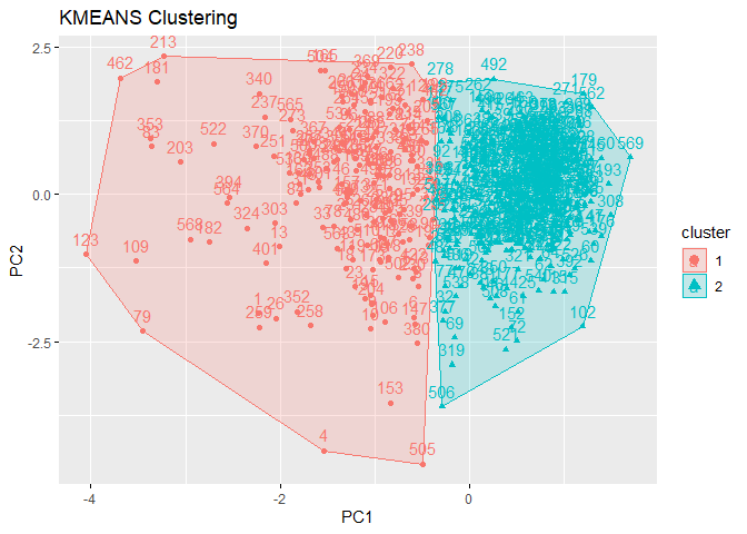
library(factoextra)
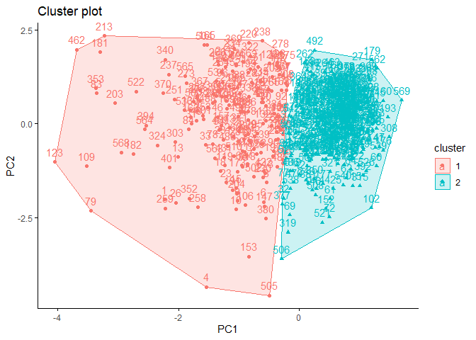
fviz_cluster(km_data,# clustering result
data = pcadata, # data
ellipse.type = "convex",
star.plot = TRUE,
repel = F,
ggtheme = theme_minimal()
)
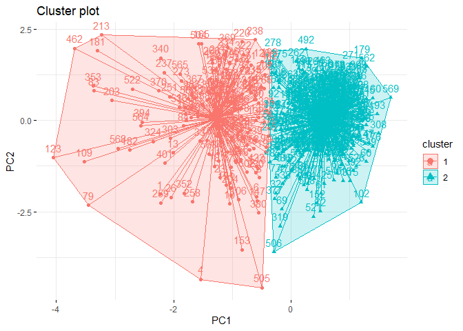
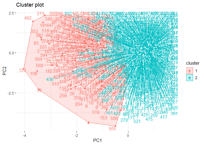
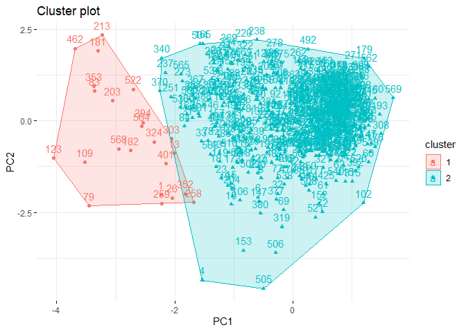
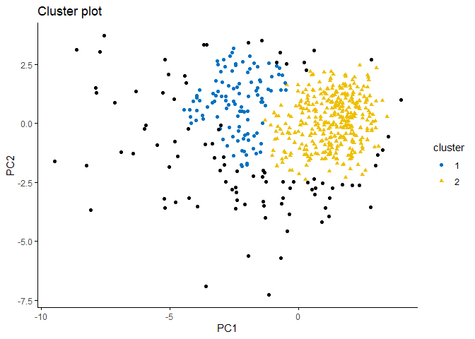
It may be possible to interpret this plot as follows:
-
Separation can be observed only in PC1 dimension.
-
Within sum of square of cluster 2 is much than cluster 1.
-
The reason of this needs to be difference between observation numbers of clusters.
-
There is no visible overlap between clusters.
It is also possible to cluster data with eclustfunction from
factoextra package.
k2m_data <- factoextra::eclust(df, # data
                               "kmeans", # clustering algorithm
                               k = 2, # cluster number
                               nstart = 25, # iteration number
                               graph = F)
k2m_data
## K-means clustering with 2 clusters of sizes 171, 398
##
## Cluster means:
##         PC1         PC2
## 1 -3.001746  0.07482399
## 2  1.289695 -0.03214799
##
## Clustering vector:
##   [1] 1 1 1 1 1 1 1 1 1 1 2 1 1 2 1 1 2 1 1 2 2 2 1 1 1 1 1 1 1 1 1 2 1 1 1 1 2
##  [38] 2 2 2 2 2 1 2 2 1 2 2 2 2 2 2 2 1 2 2 1 1 2 2 2 2 1 2 2 1 2 2 2 2 1 2 1 2
##  [75] 2 2 2 1 1 2 2 2 1 1 2 1 2 1 2 1 2 2 2 2 1 1 2 2 2 2 2 2 2 2 2 1 2 2 1 2 2
## [112] 2 1 2 2 2 2 1 1 2 2 1 1 2 2 2 2 1 1 1 2 1 1 2 1 2 2 2 1 2 2 2 2 2 2 2 1 2
## [149] 2 2 2 2 1 2 2 2 1 2 2 2 2 1 1 2 1 2 2 2 1 2 2 2 1 2 2 2 2 1 2 2 1 1 2 2 2
## [186] 2 2 2 2 2 1 2 2 2 1 2 1 1 1 2 2 1 1 1 2 2 2 2 2 2 1 2 1 1 1 2 2 2 1 1 2 2
## [223] 2 1 2 2 2 2 2 1 1 2 2 1 2 2 1 1 2 1 2 2 2 2 1 2 2 2 2 2 1 2 1 1 1 2 1 1 1
## [260] 1 1 2 1 2 1 1 2 2 2 2 2 2 1 2 2 2 2 2 2 2 1 2 1 1 2 2 2 2 2 2 2 2 2 2 2 2
## [297] 2 2 2 2 1 2 1 2 2 2 2 2 2 2 2 2 2 2 2 2 2 1 2 2 2 1 2 1 2 2 2 2 1 1 1 2 2
## [334] 2 2 1 2 1 2 1 2 2 2 1 2 2 2 2 2 2 2 1 1 2 2 2 2 2 2 2 2 2 2 2 2 1 1 2 1 1
## [371] 1 2 1 1 2 1 2 2 2 1 2 2 2 2 2 2 2 2 2 1 2 2 1 1 2 2 2 2 2 2 1 2 2 2 2 2 2
## [408] 2 1 2 2 2 2 2 2 2 2 1 2 2 2 1 2 2 2 2 2 2 2 2 1 2 1 1 2 2 2 2 2 2 2 1 2 2
## [445] 1 2 1 2 2 1 2 1 2 2 2 2 2 2 2 2 1 1 2 2 2 2 2 2 1 2 2 2 2 2 2 2 2 2 2 1 2
## [482] 2 2 2 2 2 2 1 2 2 2 2 1 2 2 2 2 2 1 1 2 1 2 1 1 2 2 2 2 1 2 2 1 2 2 2 1 1
## [519] 2 2 2 1 2 2 2 2 2 2 2 2 2 2 2 1 2 1 2 2 2 2 2 2 2 2 2 2 2 2 2 2 2 2 2 2 2
## [556] 2 2 2 2 2 2 2 1 1 1 1 2 1 2
##
## Within cluster sum of squares by cluster:
## [1] 1216.540 1121.768
##  (between_SS / total_SS =  48.5 %)
##
## Available components:
##
##  [1] "cluster"      "centers"      "totss"        "withinss"     "tot.withinss"
##  [6] "betweenss"    "size"         "iter"         "ifault"       "silinfo"
## [11] "nbclust"      "data"
If you examine output of k2m_data object, you can see that it gives
almost same output as kmeans function. There will be other information
that you can get from clustering done with eclust function. For
example, with k2m_data$silinfo you can get silhouette values for each
observation. This can help you to question validity of your clustering.
In addition, you can also plot clustering plot without the need for
fviz_cluster function. There are two ways to do this.
At first you can change graph argument in function as follows:
k2m_data <- factoextra::eclust(pcadata,
                               "kmeans",
                               k = 2,
                               nstart = 25,
                               graph = T)
You can also reach plot with following code:
k2m_data$clust_plot
3.3. k-means in Python
You can use sklearn.cluster library to implement k-means clustering in python. However, you cannot get the similar output like R. You need to call for every information you need to see it.
from sklearn.cluster import KMeans

kmeans2 = KMeans(n_clusters=2, # the number of clusters to form
                 random_state=0, # determines random number generation for centroid initialization.
                 n_init=25, # number of times the k-means algorithm is run with different centroid seeds
                 algorithm='lloyd' # k-means algorithm to use.
                 )

kmeans2.fit(df)
To see a R-like output, you can use the following codes:
# for loop to determines each object's cluster
zero = []
one = []
for i in kmeans2.labels_:
    if i == 0:
        zero.append(i)
    else:
        one.append(i)

# printing output
print('\n',
      "Cluster centers:", '\n',
      "Cluster 0 :", kmeans2.cluster_centers_[0],'\n',
       "Cluster 1 :", kmeans2.cluster_centers_[1], '\n','\n',
        "Clustering vector:" ,'\n', kmeans2.labels_, '\n','\n',
         "Total Within Cluster Sum of Squares : ", '\n',
         kmeans2.inertia_ , '\n',
          "Observation numbers :", '\n',
          "Cluster 0 :", len(zero), '\n',
          "Cluster 1 :", len(one))

Cluster centers:
 Cluster 0 : [ 3.00438761 -0.07488982]
 Cluster 1 : [-1.29082985  0.03217628]

 Clustering vector:
 [0 0 0 0 0 0 0 0 0 0 1 0 0 1 0 0 1 0 0 1 1 1 0 0 0 0 0 0 0 0 0 1 0 0 0 0 1
 1 1 1 1 1 0 1 1 0 1 1 1 1 1 1 1 0 1 1 0 0 1 1 1 1 0 1 1 0 1 1 1 1 0 1 0 1
 1 1 1 0 0 1 1 1 0 0 1 0 1 0 1 0 1 1 1 1 0 0 1 1 1 1 1 1 1 1 1 0 1 1 0 1 1
 1 0 1 1 1 1 0 0 1 1 0 0 1 1 1 1 0 0 0 1 0 0 1 0 1 1 1 0 1 1 1 1 1 1 1 0 1
 1 1 1 1 0 1 1 1 0 1 1 1 1 0 0 1 0 1 1 1 0 1 1 1 0 1 1 1 1 0 1 1 0 0 1 1 1
 1 1 1 1 1 0 1 1 1 0 1 0 0 0 1 1 0 0 0 1 1 1 1 1 1 0 1 0 0 0 1 1 1 0 0 1 1
 1 0 1 1 1 1 1 0 0 1 1 0 1 1 0 0 1 0 1 1 1 1 0 1 1 1 1 1 0 1 0 0 0 1 0 0 0
 0 0 1 0 1 0 0 1 1 1 1 1 1 0 1 1 1 1 1 1 1 0 1 0 0 1 1 1 1 1 1 1 1 1 1 1 1
 1 1 1 1 0 1 0 1 1 1 1 1 1 1 1 1 1 1 1 1 1 0 1 1 1 0 1 0 1 1 1 1 0 0 0 1 1
 1 1 0 1 0 1 0 1 1 1 0 1 1 1 1 1 1 1 0 0 1 1 1 1 1 1 1 1 1 1 1 1 0 0 1 0 0
 0 1 0 0 1 0 1 1 1 0 1 1 1 1 1 1 1 1 1 0 1 1 0 0 1 1 1 1 1 1 0 1 1 1 1 1 1
 1 0 1 1 1 1 1 1 1 1 0 1 1 1 0 1 1 1 1 1 1 1 1 0 1 0 0 1 1 1 1 1 1 1 0 1 1
 0 1 0 1 1 0 1 0 1 1 1 1 1 1 1 1 0 0 1 1 1 1 1 1 0 1 1 1 1 1 1 1 1 1 1 0 1
 1 1 1 1 1 1 0 1 1 1 1 0 1 1 1 1 1 0 0 1 0 1 0 0 1 1 1 1 0 1 1 0 1 1 1 0 0
 1 1 1 0 1 1 1 1 1 1 1 1 1 1 1 0 1 0 1 1 1 1 1 1 1 1 1 1 1 1 1 1 1 1 1 1 1
 1 1 1 1 1 1 1 0 0 0 0 1 0 1]

 Total Within Cluster Sum of Squares :
 2342.4243127486625
 Observation numbers :
 Cluster 0 : 171
 Cluster 1 : 398
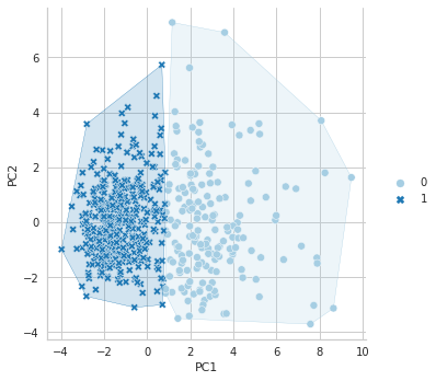
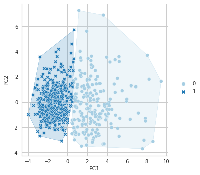
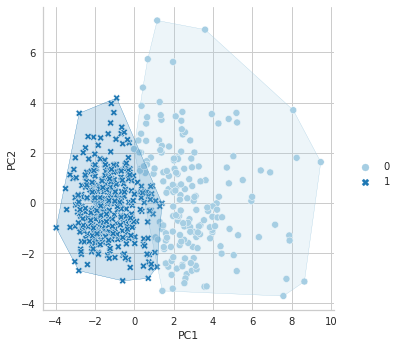
In Python, there is no library like factoextra to draw cluster plots, as far as I know. However, if you want to see your clustering result in a plot, you can use the following coes:
import seaborn as sns
from scipy.spatial import ConvexHull
from matplotlib.colors import to_rgba

sns.set_style("whitegrid")
data = pcadf
xcol = "PC1"
ycol = "PC2"
hues = [0,1]
colors = sns.color_palette("Paired", len(hues))
palette = {hue_val: color for hue_val, color in zip(hues, colors)}
plt.figure(figsize=(15,10))

g = sns.relplot(data=pcadf, x=xcol, y=ycol, hue=kmeans2.labels_, style=kmeans2.labels_, col=kmeans2.labels_, palette=palette, kind="scatter")
# function for borders
def overlay_cv_hull_dataframe(x, y, color, data, hue):
    for hue_val, group in pcadf.groupby(hue):
        hue_color = palette[hue_val]
        points = group[[x, y]].values
        hull = ConvexHull(points)
        plt.fill(points[hull.vertices, 0], points[hull.vertices, 1],
                 facecolor=to_rgba(hue_color, 0.2),
                 edgecolor=hue_color)
g.map_dataframe(overlay_cv_hull_dataframe, x=xcol, y=ycol, hue=kmeans2.labels_)
g.set_axis_labels(xcol, ycol)

plt.show()
References for Chapter
[1] Hartigan, John A., Manchek A. Wong. Algorithm AS 136: A k-means clustering algorithm. Journal of royal statistical society. series c (applied statistics) 28., 100–108, 1979
[2] Kassambara, Alboukadel. Practical guide to cluster analysis in R: Unsupervised machine learning. Vol. 1. Sthda, 2017.
[3] James, G., Witten, D., Hastie, T., & Tibshirani, R. (2013). An introduction to statistical learning (Vol. 112, p. 18). New York: springer.
[4] Kassambara, Alboukadel. Practical guide to cluster analysis in R: Unsupervised machine learning. Vol. 1. Sthda, 2017.
[5] Ben-Hur, Asa, and Isabelle Guyon. Detecting stable clusters using principal component analysis. Functional genomics. Humana press, 159–182, 2003.
[6] Ding, Chris, and Xiaofeng He. K-means clustering via principal component analysis. Proceedings of twenty-first international conference on Machine learning. 2004.
4. k-medoids Clustering
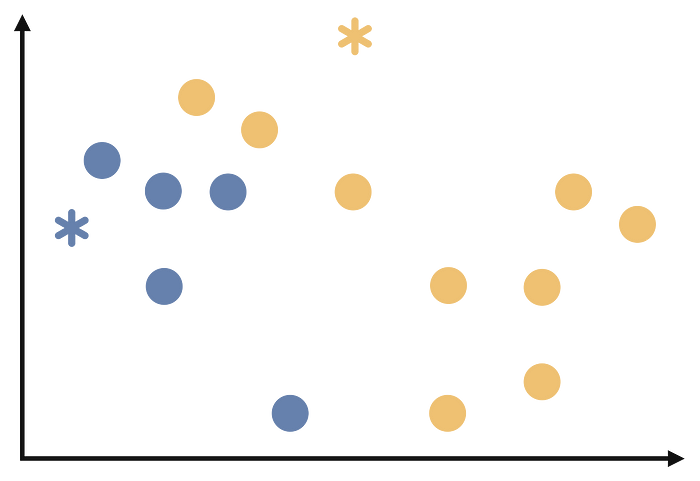
k-medoids clustering algorithm is a partitioning algorithm that is very similar to k-means clustering algorithm. As you may recall from the previous section, in the k-means clustering algorithm, each cluster is represented by the average of its elements. In the k-medoids algorithm, each cluster is represented by one of its elements. In other words, each cluster is formed with one of its elements in the center. The main goal of the k-medoids clustering algorithm, also called Partitioning Around Medoids, is to minimize the distance between medoids and other observations as much as possible [1], [2].
Since the k-medoids algorithm is very similar to k-means, I will use the illustrations used in k-means. However, at this point, attention should be paid to the fourth step. Please pay attention to what is written in the fourth step when analyzing the following steps.
Step 1:
The number of clusters is determined.
Step 2:
From the dataset, k random observations are selected as cluster centers. This step can be illustrated as follows.
Step 3
Each observation is assigned to the cluster belonging to the cluster center closest to it. We will start assigning each observation as follows.
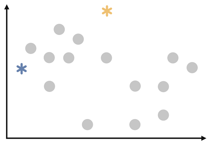
Step 4
This step is where the k-means and k-medoids algorithms diverge. In k-means, the center is the averages, while in k-medoids the center is chosen as the observation closest to all observations in that cluster. In the illustration below, assume that the darker of the newly selected asterisked points is another observation:
Step 5
Repeat steps 3 and 4 until the cluster assignments no longer change or reach a maximum number of iterations.
4.1. k-medoids in R
There are many packages and functions available to implement the k-means
algorithm in R. In this chapter, the pam function in the
clusterpackage is used. We will again use Breast Cancer
Wisconsin
data set from the UCI Machine Learning Repository.
If you read Chapter 2, you will remember that I compared cluster number determination methods on the same data set. All methods predominantly suggested two cluster numbers. That is why I will cluster the data for 2 clusters. If you also read Chapter 3, you already know what is done in the data preparation part.
We do clustering with pam function and then we store the clustering
result in the pam_data object. Then we print this object with
printfunction.
library(cluster)
pam_data <- pam(df,2)
print(pam_data)
## Medoids:
##       ID       PC1        PC2
## [1,] 499 -2.357211 0.30131315
## [2,] 269  1.358672 0.03762238
## Clustering vector:
##   [1] 1 1 1 1 1 1 1 1 1 1 2 1 1 1 1 1 2 1 1 2 2 2 1 1 1 1 1 1 1 1 1 2 1 1 1 1 2
##  [38] 2 2 2 2 2 1 2 2 1 2 1 2 2 2 2 2 1 2 2 1 1 2 2 2 2 1 2 2 1 2 2 2 2 1 2 1 2
##  [75] 2 1 2 1 1 2 2 1 1 1 2 1 2 1 2 1 2 1 2 2 1 1 2 2 2 2 2 2 2 2 2 1 2 2 1 2 2
## [112] 2 1 2 2 2 2 1 1 1 2 1 1 2 2 2 2 1 1 1 2 1 1 2 1 2 2 2 1 2 2 1 2 2 2 2 1 2
## [149] 2 2 2 2 1 2 2 2 1 2 2 2 2 1 1 2 1 2 2 1 1 2 2 2 1 2 2 2 2 1 2 2 1 1 2 2 2
## [186] 2 1 2 2 2 1 2 2 2 1 2 1 1 1 1 2 1 1 1 2 2 2 1 2 2 1 2 1 1 1 1 2 2 1 1 2 2
## [223] 2 1 2 2 2 2 2 1 1 2 2 1 2 2 1 1 2 1 2 2 2 2 1 2 2 2 2 2 1 2 1 1 1 2 1 1 1
## [260] 1 1 2 1 2 1 1 2 2 2 2 2 2 1 2 1 2 2 1 2 2 1 2 1 1 2 2 2 2 2 2 1 2 2 2 2 2
## [297] 2 2 2 2 1 2 1 2 2 2 2 2 2 2 2 2 2 2 2 2 2 1 2 2 2 1 2 1 2 2 2 2 1 1 1 2 2
## [334] 2 2 1 2 1 2 1 2 2 2 1 2 2 2 2 2 2 2 1 1 1 2 2 2 2 2 2 2 2 2 2 2 1 1 2 1 1
## [371] 1 2 1 1 2 1 2 2 2 1 2 2 2 2 2 2 2 2 2 1 2 2 1 1 2 2 2 2 2 2 1 2 2 2 2 2 2
## [408] 2 1 2 2 2 2 2 2 2 2 1 2 2 2 1 2 2 2 2 2 2 2 2 1 2 1 1 2 2 2 2 2 2 2 1 2 2
## [445] 1 2 1 2 2 1 2 1 2 2 2 2 2 2 2 2 1 1 2 2 2 2 2 2 1 2 2 2 2 2 2 2 2 2 2 1 2
## [482] 2 2 2 1 2 2 1 2 2 2 2 1 2 2 2 2 2 1 1 2 1 2 1 1 2 2 2 2 1 2 2 1 2 2 2 1 1
## [519] 2 2 2 1 2 2 2 2 2 2 2 2 2 2 2 1 2 1 1 2 2 2 2 2 2 2 2 2 2 2 2 2 2 2 2 2 2
## [556] 2 2 2 2 2 2 2 1 1 1 1 1 1 2
## Objective function:
##    build     swap
## 1.806580 1.700399
##
## Available components:
##  [1] "medoids"    "id.med"     "clustering" "objective"  "isolation"
##  [6] "clusinfo"   "silinfo"    "diss"       "call"       "data"
If we examine the output obtained with the print function; at first we can access the medoid information of each cluster for both PC1 and PC2 dimensions. We notice that the center of the first cluster is the observation with the 499th index in the dataset, while the second cluster is the observation with the 269th index. Next, we see the clustering vector, which contains the information to which cluster each observation is assigned. Finally, we see the objective function. “Build” represents the first step in the k-median calculation and “Swap” represents the third step.
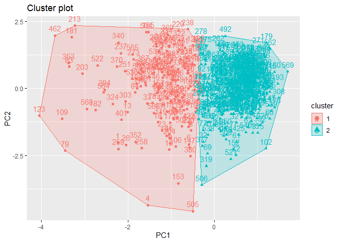
Just as with k-means, we can use the fviz_cluster function in the factoextra package to plot the cluster graph as follows:
library(factoextra)
fviz_cluster(pam_data,# clustering result
             data = df, # data
             ellipse.type = "convex", # type of the clusters' appearence
             repel = F,
             ggtheme = theme_classic()
)
According to the cluster plot, no overlap is observed. The separation occurs only in the PC1 dimension. The variance in the first cluster shown in red color is higher.
4.2. k-medoids in Python
In Python, you can built k-medoids clustering using the KMedoids function in the sklearn_extra.cluster package. However, it is not possible to get an R-like output just like the KMeans function. We can still get a similar output with our own code.
from sklearn_extra.cluster import KMedoids

# clustering
kmedoids2 = KMedoids(n_clusters=2)
kmedoids2.fit(df)

# output
zero = []
one = []
for i in kmedoids2.labels_:
    if i == 0:
        zero.append(i)
    else:
        one.append(i)


print('\n',
      "Cluster medoids:", '\n',
      "Cluster 0 :", kmedoids2.cluster_centers_[0],'\n',
       "Cluster 1 :", kmedoids2.cluster_centers_[1], '\n','\n',
        "Clustering vector:" ,'\n', kmedoids2.labels_, '\n','\n',
         "Total Within Cluster Sum of Squares : ", '\n',
         kmedoids2.inertia_ , '\n',
          "Observation numbers :", '\n',
          "Cluster 0 :", len(zero), '\n',
          "Cluster 1 :", len(one))

 Cluster medoids:
 Cluster 0 : [ 2.35928485 -0.30157828]
 Cluster 1 : [-1.35986794 -0.03765549]

 Clustering vector:
 [0 0 0 0 0 0 0 0 0 0 1 0 0 0 0 0 1 0 0 1 1 1 0 0 0 0 0 0 0 0 0 1 0 0 0 0 1
 1 1 1 1 1 0 1 1 0 1 0 1 1 1 1 1 0 1 1 0 0 1 1 1 1 0 1 1 0 1 1 1 1 0 1 0 1
 1 0 1 0 0 1 1 0 0 0 1 0 1 0 1 0 1 0 1 1 0 0 1 1 1 1 1 1 1 1 1 0 1 1 0 1 1
 1 0 1 1 1 1 0 0 0 1 0 0 1 1 1 1 0 0 0 1 0 0 1 0 1 1 1 0 1 1 0 1 1 1 1 0 1
 1 1 1 1 0 1 1 1 0 1 1 1 1 0 0 1 0 1 1 0 0 1 1 1 0 1 1 1 1 0 1 1 0 0 1 1 1
 1 0 1 1 1 0 1 1 1 0 1 0 0 0 0 1 0 0 0 1 1 1 0 1 1 0 1 0 0 0 0 1 1 0 0 1 1
 1 0 1 1 1 1 1 0 0 1 1 0 1 1 0 0 1 0 1 1 1 1 0 1 1 1 1 1 0 1 0 0 0 1 0 0 0
 0 0 1 0 1 0 0 1 1 1 1 1 1 0 1 0 1 1 0 1 1 0 1 0 0 1 1 1 1 1 1 0 1 1 1 1 1
 1 1 1 1 0 1 0 1 1 1 1 1 1 1 1 1 1 1 1 1 1 0 1 1 1 0 1 0 1 1 1 1 0 0 0 1 1
 1 1 0 1 0 1 0 1 1 1 0 1 1 1 1 1 1 1 0 0 0 1 1 1 1 1 1 1 1 1 1 1 0 0 1 0 0
 0 1 0 0 1 0 1 1 1 0 1 1 1 1 1 1 1 1 1 0 1 1 0 0 1 1 1 1 1 1 0 1 1 1 1 1 1
 1 0 1 1 1 1 1 1 1 1 0 1 1 1 0 1 1 1 1 1 1 1 1 0 1 0 0 1 1 1 1 1 1 1 0 1 1
 0 1 0 1 1 0 1 0 1 1 1 1 1 1 1 1 0 0 1 1 1 1 1 1 0 1 1 1 1 1 1 1 1 1 1 0 1
 1 1 1 0 1 1 0 1 1 1 1 0 1 1 1 1 1 0 0 1 0 1 0 0 1 1 1 1 0 1 1 0 1 1 1 0 0
 1 1 1 0 1 1 1 1 1 1 1 1 1 1 1 0 1 0 0 1 1 1 1 1 1 1 1 1 1 1 1 1 1 1 1 1 1
 1 1 1 1 1 1 1 0 0 0 0 0 0 1]

 Total Within Cluster Sum of Squares :
 968.3783653743097
 Observation numbers :
 Cluster 0 : 190
 Cluster 1 : 379
Again, just like KMeans, you can draw a clustering plot with the following code.
sns.set_style("whitegrid")
data = pcadf
xcol = "PC1"
ycol = "PC2"
hues = [0,1]
colors = sns.color_palette("Paired", len(hues))
palette = {hue_val: color for hue_val, color in zip(hues, colors)}
plt.figure(figsize=(15,10))

g = sns.relplot(data=df, x=xcol, y=ycol, hue=kmedoids2.labels_, style=kmedoids2.labels_, col=kmedoids2.labels_, palette=palette, kind="scatter")

g.map_dataframe(overlay_cv_hull_dataframe, x=xcol, y=ycol, hue=kmedoids2.labels_)
g.set_axis_labels(xcol, ycol)

plt.show()
References for Chapter
[1] Kaufman, L., & Rousseeuw, P. (1987). Clustering by means of medoids. Statistical Data Analysis Based on the L1-Norm and Related Methods, Y. Dodge Ed.
[2] Kaufman, L., & Rousseeuw, P. J. (2009). Finding groups in data: an introduction to cluster analysis. John Wiley & Sons
k-means and k-medoids cheat sheet

5. Hierarchical Clustering
Hierarchical Clustering is an algorithm in which objects are organized in a tree-like structure of clusters, called a dendrogram. There are two main types of hierarchical clustering: Agglomerative and Divisive. [1], [2], [3] While Divisive Hierarchical Clustering considers the dataset as a single cluster and then iteratively decomposes it into smaller clusters based on their similarities, Agglomerative Hierarchical Clustering considers each observation as a cluster and then iteratively merges them into larger clusters based on their similarities. At this point, the important part is how these merges/separations are made. Various linkage methods have been developed for this purpose. Below you can see the names of these linkage methods and how the linking operations are performed:
-
Single linkage: Also known as the nearest-neighbor method, this method calculates the distance between the closest points of the two clusters being merged. [4]
-
Complete linkage: Also known as the farthest-neighbor method, this method calculates the distance between the furthest points of the two clusters being merged.[5]
-
Average linkage: This method calculates the average distance between all pairs of points in the two clusters being merged. [6]
-
Ward’s Minimum Variance linkage: This method minimizes the variance of the distances between points within the same cluster. It merges the clusters that result in the smallest increase in the total sum of squared distances within each cluster.[7]
The choice of linkage method can have a significant impact on the resulting clusters, as each method has its own strengths and weaknesses. Therefore, it is important to carefully consider which linkage method is most appropriate for the data and the specific problem being addressed. In this book, two metrics which are Ward’s Minimum Variance Method and Average linkage method is used.
5.1. Cophenetic Distance
In the previous sections, we mentioned that Euclidean metric is usually used in distance metric applications. In the case of hierarchical clustering, we can also use Cophenetic distance to decide on the distance metric. Cophenetic distance is a measure used in hierarchical clustering to evaluate the similarity between two observations in the dendrogram produced by the clustering algorithm. It is defined as the distance between two observations in the original data space at the level where they first merge into the same cluster in the dendrogram [8]. A high correlation between the cophenetic distance and the original distance between observations in the data space indicates that the clustering solution preserves the structure of the data well.
5.1.1. Cophenetic Distance in R
There are many packages and functions available to implement k-means
algorithm in R. In this article, I will show you cophenetic function in
the stats package. Again, the same data set, Breast Cancer
Wisconsin
from the UCI Machine Learning Repositoryi is used in the analysis.
At first, we need to calculate Euclidean and Manhattan distances between observations:
dist_euc <- dist(df, method="euclidean") # data, distance metric
dist_man <- dist(df, method="manhattan") # data, distance metric
Secondly, we need to hierarchically cluster data set with both distance metric.
hc_e <- hclust(d=dist_euc, method="ward.D2")
hc_m <- hclust(d=dist_man, method="ward.D2")
Lastly, we need to calculate cophenetic distance for both of the clusterings, and check the correlation coefficient between distance metric and cophenetic distance.
# for euclidean distance
coph_e <- cophenetic(hc_e)
cor(dist_euc,coph_e)
## [1] 0.6711685
# for manhattan distance
coph_m <- cophenetic(hc_m)
cor(dist_man,coph_m)
## [1] 0.6018289
In general, a higher cophenetic correlation coefficient indicates that the dendrogram is a more accurate representation of the pairwise distances between the original data points. Cophenetic correlation coefficient can range between 0 and 1, with a value of 1 indicating a perfect fit between the dendrogram and the pairwise distances.
In this case it can be said that when the correlation between Cophenetic and distance matrix is examined, it is observed that hierarchical clustering with Euclidean distance gives better results. That’s why we will continue the analysis with Euclidean distance metric.
5.2. Ward’s Minimum Variance Method
5.2.1. R
To determine the number of clusters in hierarchical clustering, we can use methods to determine the optimal number of clusters, just as we do with k-means and k-medoids. This is discussed in Section 2 and will not be discussed in this section. However, it may be useful to remind that all methods recommend 2 as the optimal number of clusters.
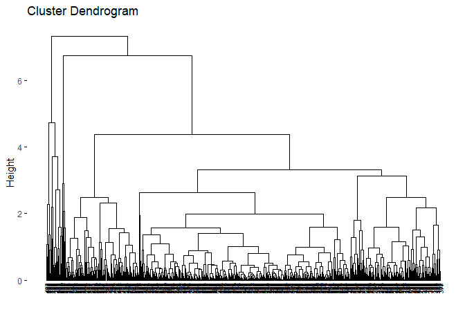
Another way to determine the number of clusters for hierarchical clustering is to check the dendogram and decide where to cut. However, I personally find this method “open-ended” but I will share the codes and the dendogram with you.
You can use fviz_dend function in factoextra package to visualise
dendogram of a hierarchical clustering with the object you created from
hierarchical clustering with the function hclust from stats package.
hc_e <- hclust(d=dist_euc, method="ward.D2")
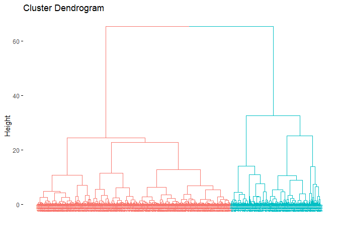
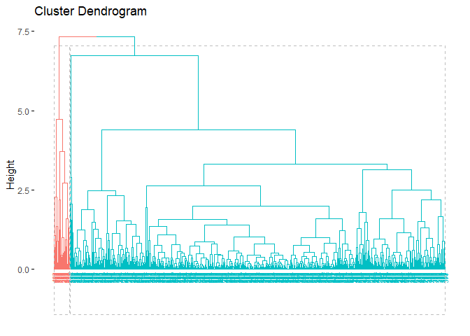
fviz_dend(hc_e,cex=.5)
According to the dendogram, it can be said that the best height value to
cut the dendogram is 35–40. This also refers to 2 clusters. Lets
hierarchically cluster the data set with 2 clusters. cutree function
from stats package can be used to do that.
grupward2 <- cutree(hc_e, k = 2)
table(grupward2) # gives observation number in each cluster
## grupward2
##   1   2
## 180 389
grupward2 # gives cluster assignments for each observation
##   [1] 1 1 1 1 1 1 1 1 1 1 2 2 1 2 1 1 2 1 1 2 2 2 1 1 1 1 1 1 1 1 1 1 1 1 1 1 2
##  [38] 2 2 2 2 1 1 1 2 1 2 1 2 2 2 2 2 1 2 2 1 1 2 2 2 2 1 2 1 1 2 2 1 2 1 2 1 2
##  [75] 2 2 1 1 1 2 2 1 1 1 2 1 2 1 2 1 2 2 2 2 1 1 2 2 2 2 2 2 2 2 2 1 2 2 1 2 2
## [112] 2 1 2 2 2 2 1 1 2 2 1 1 2 2 2 2 2 1 1 2 2 2 2 1 2 2 2 1 2 2 2 2 2 2 2 1 2
## [149] 2 2 2 2 1 2 2 2 1 2 2 2 2 1 1 2 1 2 2 2 1 2 2 2 1 2 2 2 2 1 2 2 1 1 2 2 2
## [186] 2 2 2 2 2 1 2 2 1 1 2 1 2 1 2 2 2 1 1 2 2 2 2 1 2 1 2 1 1 2 1 2 2 1 1 2 2
## [223] 2 2 2 2 2 2 2 1 1 2 2 1 2 2 1 1 2 1 2 2 2 2 1 2 2 2 2 2 1 2 1 1 1 2 1 1 1
## [260] 1 1 2 1 2 1 1 2 2 2 2 2 2 1 2 2 2 2 2 2 2 1 2 1 1 2 2 2 2 2 2 2 2 2 2 2 2
## [297] 2 2 2 2 1 2 1 2 2 2 2 2 2 2 2 2 2 2 2 2 2 1 1 2 2 1 2 1 2 2 2 2 1 1 2 2 2
## [334] 2 2 1 2 1 2 1 2 2 2 1 2 2 2 2 2 2 2 1 1 2 2 2 1 2 2 2 2 2 2 2 2 1 1 2 1 1
## [371] 1 2 1 1 2 2 1 2 2 1 2 2 2 2 2 2 2 2 2 1 2 2 1 1 2 2 2 2 2 2 1 2 2 2 2 2 2
## [408] 2 1 2 2 2 2 2 2 2 2 1 2 2 2 1 2 2 2 2 2 2 2 2 1 2 1 1 2 2 2 2 2 2 2 2 2 2
## [445] 1 2 1 2 2 1 2 1 2 2 2 2 2 2 2 2 1 1 2 2 2 2 2 2 1 1 2 2 2 2 2 2 2 2 2 1 2
## [482] 2 2 2 2 1 2 1 2 2 2 2 1 2 2 2 2 2 1 1 2 1 2 1 1 1 2 2 2 1 2 2 1 2 2 2 1 1
## [519] 1 2 2 1 2 2 2 2 2 2 1 2 2 2 2 1 2 1 2 1 2 2 2 2 2 2 2 2 2 2 2 2 2 2 2 2 2
## [556] 2 2 2 2 2 2 2 1 1 1 1 2 1 2
Now, we can again visualize the dendogram. However, this time, we can color the clusters.
fviz_dend(hc_e, # clustering result
          k = 2, # cluster number
          cex = 0.5,
          color_labels_by_k = TRUE,
          rect = F )
Just as we did in the previous clustering algorithms, we can also
visualize cluster graph with fviz_cluster function in factoextra
package:
fviz_cluster(list(data = pcadata, cluster = grupward2),
             ellipse.type = "convex",
             repel = TRUE,
             show.clust.cent = FALSE, ggtheme = theme_minimal())
When the cluster graph is analyzed, overlap can be observed. It can be seen that the separation occurs only in both PC1 and PC2. While the variance in the first cluster shown in red is high, the variance in the second cluster shown in green is low.
5.2.2. Python
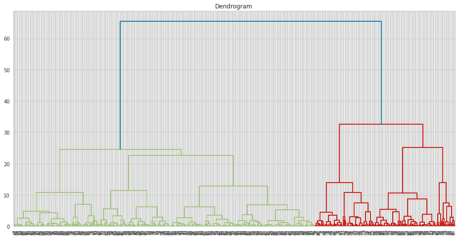
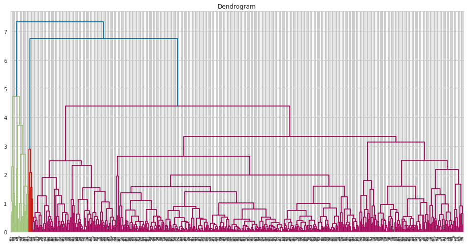
In Python, at first, we can draw dendogram as follows:
import scipy.cluster.hierarchy as sch
plt.figure(figsize = (16 ,8))

dendrogram = sch.dendrogram(sch.linkage(df, method  = "ward"))

plt.title("Dendrogram")
plt.show()
To build Ward’s model, you can use AgglomerativeClustering function as follows:
from sklearn.cluster import AgglomerativeClustering

hc = AgglomerativeClustering(n_clusters = 2, metric = "euclidean", linkage = "ward")

ward2 = hc.fit_predict(df)
Again, we can create R-like output as follows:
zero = []
one = []
for i in ward2:
    if i == 0:
        zero.append(i)
    else:
        one.append(i)

print("Observation Numbers :", '\n',
    "Cluster 0: ", len(zero),'\n',
    "Cluster 1: ", len(one))

Observation Numbers :
 Cluster 0:  180
 Cluster 1:  389
You can follow codes in the below to draw clustering plot:
data = df
xcol = "PC1"
ycol = "PC2"
hues = [0,1]
colors = sns.color_palette("Paired", len(hues))
palette = {hue_val: color for hue_val, color in zip(hues, colors)}
plt.figure(figsize=(15,10))
g = sns.relplot(data=df, x=xcol, y=ycol, hue=ward2, style=ward2, col=ward2, palette=palette, kind="scatter")

g.map_dataframe(overlay_cv_hull_dataframe, x=xcol, y=ycol, hue=ward2)
g.set_axis_labels(xcol, ycol)

plt.show()
5.3. Average Linkage Method
R
Since cophenetic distance is covered in the Ward’s Minimum Variance
Method, it will not be shared with you in this part. However, it is
necessary to state that Euclidean distance again gave the better
results. Again, you can use fviz_dend function in factoextra package
to visualise dendogram of a hierarchical clustering with the object you
created from hierarchical clustering with the function hclust from
stats package.
hc_e2 <- hclust(d=dist_euc, method="average")
fviz_dend(hc_e2,cex=.5)
As we can see from the dendogram easily, it is very different from the Ward’s dendogram. It seems clusters are highly unbalanced with respect to the Ward. This may cause a problem for the cluster analysis. However, it is a beneficial example to show that linkage is highly dependent on the data set. It is crucial to decide the best linkage method for the data. One way to decide the linkage is to check the descriptive statistics of the data set to see if there are outliers. Another way is to try all of the linkage methods to see which dendogram looks fine.
Again, it is hard to interpret it from the dendogram, but we will continue with 2 clusters. One reason is the methods to determine the optimal number of clusters suggested cluster number to be 2. Another reason is to compare the result with Ward’s Minimum Variance methods.
grupav2 <- cutree(hc_e2, k = 2)
grupav2
##   [1] 1 2 2 2 2 2 2 2 2 2 2 2 1 2 2 2 2 2 2 2 2 2 2 2 2 1 2 2 2 2 2 2 2 2 2 2 2
##  [38] 2 2 2 2 2 2 2 2 2 2 2 2 2 2 2 2 2 2 2 2 2 2 2 2 2 2 2 2 2 2 2 2 2 2 2 2 2
##  [75] 2 2 2 2 1 2 2 2 1 2 2 2 2 2 2 2 2 2 2 2 2 2 2 2 2 2 2 2 2 2 2 2 2 2 1 2 2
## [112] 2 2 2 2 2 2 2 2 2 2 2 1 2 2 2 2 2 2 2 2 2 2 2 2 2 2 2 2 2 2 2 2 2 2 2 2 2
## [149] 2 2 2 2 2 2 2 2 2 2 2 2 2 2 2 2 2 2 2 2 2 2 2 2 2 2 2 2 2 2 2 2 1 1 2 2 2
## [186] 2 2 2 2 2 2 2 2 2 2 2 2 2 2 2 2 2 1 2 2 2 2 2 2 2 2 2 1 2 2 2 2 2 2 2 2 2
## [223] 2 2 2 2 2 2 2 2 2 2 2 2 2 2 2 2 2 2 2 2 2 2 2 2 2 2 2 2 2 2 2 2 2 2 2 1 1
## [260] 2 2 2 2 2 2 2 2 2 2 2 2 2 2 2 2 2 2 2 2 2 2 2 2 2 2 2 2 2 2 2 2 2 2 2 2 2
## [297] 2 2 2 2 2 2 1 2 2 2 2 2 2 2 2 2 2 2 2 2 2 2 2 2 2 2 2 1 2 2 2 2 2 2 2 2 2
## [334] 2 2 2 2 2 2 2 2 2 2 2 2 2 2 2 2 2 2 1 1 2 2 2 2 2 2 2 2 2 2 2 2 2 2 2 2 2
## [371] 2 2 2 2 2 2 2 2 2 2 2 2 2 2 2 2 2 2 2 2 2 2 2 1 2 2 2 2 2 2 1 2 2 2 2 2 2
## [408] 2 2 2 2 2 2 2 2 2 2 2 2 2 2 2 2 2 2 2 2 2 2 2 2 2 2 2 2 2 2 2 2 2 2 2 2 2
## [445] 2 2 2 2 2 2 2 2 2 2 2 2 2 2 2 2 2 1 2 2 2 2 2 2 2 2 2 2 2 2 2 2 2 2 2 2 2
## [482] 2 2 2 2 2 2 2 2 2 2 2 2 2 2 2 2 2 2 2 2 2 2 2 2 2 2 2 2 2 2 2 2 2 2 2 2 2
## [519] 2 2 2 1 2 2 2 2 2 2 2 2 2 2 2 2 2 2 2 2 2 2 2 2 2 2 2 2 2 2 2 2 2 2 2 2 2
## [556] 2 2 2 2 2 2 2 2 1 2 2 2 1 2
table(grupav2)
## grupav2
##   1   2
##  23 546
As we can see from the output, clusters are highly unbalanced. This output was expected since we observe dendogram.
Again, we can again visualize the dendogram. However, this time, we can color the clusters.
fviz_dend(hc_e2, k = 2,
          cex = 0.5,
          color_labels_by_k = TRUE,
          rect = TRUE )
Again, just as we did in the previous clustering algorithms, we can also
visualize cluster graph with fviz_cluster function in factoextra
package:
fviz_cluster(list(data = pcadata, cluster = grupav2),
             ellipse.type = "convex",
             repel = F,
             show.clust.cent = FALSE, ggtheme = theme_minimal())
Python
At first, let me draw the dendogram:
plt.figure(figsize = (16 ,8))

dendrogram = sch.dendrogram(sch.linkage(pcadf, method  = "average"))

plt.title("Dendrogram")
plt.show()
We can build hierarchical clustering model with average linkage just by changing linkage argument of the AgglomerativeClustering function.
hc = AgglomerativeClustering(n_clusters = 3, metric = "euclidean", linkage = "average")
average3 = hc.fit_predict(pcadf)
References for Chapter
[1] Ward Jr, J. H. (1963). Hierarchical grouping to optimize an objective function. Journal of the American statistical association, 58(301), 236–244.
[2] Roux, M. (2015). A comparative study of divisive hierarchical clustering algorithms. arXiv preprint arXiv:1506.08977.
[3] Kassambara, Alboukadel. Practical guide to cluster analysis in R: Unsupervised machine learning. Vol. 1. Sthda, 2017.
[4] Kassambara, Alboukadel. Practical guide to cluster analysis in R: Unsupervised machine learning. Vol. 1. Sthda, 2017.
[5] Kassambara, Alboukadel. Practical guide to cluster analysis in R: Unsupervised machine learning. Vol. 1. Sthda, 2017.
[6] Kassambara, Alboukadel. Practical guide to cluster analysis in R: Unsupervised machine learning. Vol. 1. Sthda, 2017.
[7] Ward Jr, J. H. (1963). Hierarchical grouping to optimize an objective function. Journal of the American statistical association, 58(301), 236–244.
[8] Triayudi, A., & Fitri, I. (2018). Comparison of parameter-free agglomerative hierarchical clustering methods. ICIC Express Letters, 12(10), 973–980.
hierarchical clustering cheat sheet

6. Density Based Clustering
Beautiful weather, no work/school, you drive your car with your friends/family to a countryside. As you breathe the beautiful air into your lungs, you feel a little hungry. You take out the homemade strawberry jam and peanut butter from your bag along with the bread. Unfortunately, some of the jam spills on the ground. What are the possible situations you might encounter? Most likely a swarm of ants would make their way to the jam, and there would even be a concentration of ants at the spot where the jam spilled. Density-based clustering is a clustering algorithm that brings together ants that are closer together in a circle of a certain radius and separates the ants that have not yet reached the jam, and the ants that are approaching the jam, which are more sparse. The main idea behind density-based clustering is to identify regions in the feature space where data points are dense and then infer clusters based on these regions[1]. Density-based clustering defines clusters as regions of dense points separated from other dense regions by regions with a lower density of points[2]. The difference with all other clustering algorithms is that while all other algorithms assign all observations to a cluster, in density-based clustering some observations may not be assigned to a cluster.
Another difference between density-based clustering and the other algorithms described in this book is that the number of clusters does not need to be determined in advance. However, two parameter which are MinPts and eps need to be predetermined. eps parameter defines the radius of the circle around an observation. This is also called the epsilon neighborhood of the observation. MinPts parameter is the minimum number of neighbors within the “eps” radius. In other words, it determines how many observations to include in the circle. KNN distplot can be used to determine these values. In the application part, we will see how these values are decided with KNN distplot.
Density-based clustering algorithm results in three different types of observations ( seed points, border points and noise points) when observations are clustered or not clustered. A seed point is a point with the fewest MinPts in its epsilon neighborhood. In other words, it has a sufficient number of close neighbors to be considered part of a cluster. A border point is a point that is not a seed point but is within the epsilon neighborhood of a seed point. Boundary points can be considered as part of a cluster, but they are not as strongly connected to the cluster as seed points. A noise point is a point that does not have any seed points within its epsilon neighborhood. Noise points are usually considered outliers and are not part of any cluster. It is precisely in the formation of noise points that Density Based Clustering differs from other clustering algorithms.
Following steps may be more useful for understanding Density Based Clustering:
-
MinPts and epsilon values are determined.
-
Boundary points are defined.
-
Starting from a core point, all observations within the epsilon neighborhood are found and assigned to the same cluster. This process repeats for each core point and observations are added to the same cluster as long as they are within epsilon distance of another observation in the cluster.
-
The algorithm outputs the identified clusters.
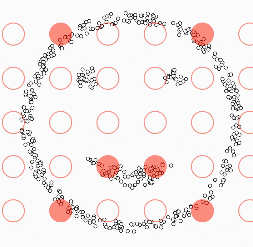
All this happens as in the small animation[3] below:
To summarize, Density Based Clustering algorithm is particularly useful for data sets with different densities. While hierarchical and partitioning-based algorithms (k-means, k-medoids) only cluster clusters in elliptical shapes, Density Based Clustering has no such restrictions. However, compared to other clustering algorithms, it can be said that it fails more on high-dimensional data.
6.1. Density Based Clustering in R
Like other clustering algorithms, Density Based Clustering can be done quite simply through R. We can easily do this with `dbscan` function in the `fpc` package. However, as I mentioned before, MinPts and eps values need to be determined beforehand. Therefore, as a first step, we will draw a kNN distplot to decide these parameters.
library(fpc)
library(dbscan)
kNNdistplot(df, k = 10)
abline(h = 1, lty = 2)
abline(h = 0.6, lty = 2)
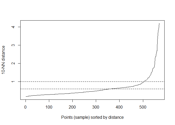
In the code, k stands for MinPts. After several trials, 10 was decided upon. When analyzing the kNNdisplot, just like the Elbow Method, the point where the line makes an “elbow” should be determined. This point should be chosen as the eps value. After various trials, the most appropriate value was decided to be 0.6.
Now that we have decided on MinPts and eps values, we can do Density Based Clustering:
db <- fpc::dbscan(df, eps = 0.6, MinPts = 10)
print(db)
## dbscan Pts=569 MinPts=10 eps=0.6
##         0   1   2
## border 96  58  27
## seed    0  49 339
## total  96 107 366
If we analyse the output, we can make the following comments:
-
Density-based clustering divided the data set into two clusters.
-
The output shows a total of 96 noise values which cannot be assigned to any cluster.
-
There are 58 border points in the first cluster and 27 in the second cluster.
-
There are 49 seed points in the first cluster and 339 seed points in the second cluster.
Just as we did in the previous clustering algorithms, we can also
visualize cluster graph with fviz_cluster function in the factoextra
package:
fviz_cluster(db, data = df, stand = FALSE,
             ellipse = FALSE, show.clust.cent = FALSE,
             geom = "point",palette = "jco", ggtheme = theme_classic())
When the plot is examined, it can be seen that the observation difference between the clusters is small. The excess of noise values(black points) is also noteworthy.
6.2. Density Based Clustering in Python
In Python, we can draw kNN distplot as follows:
from sklearn.neighbors import NearestNeighbors

nbrs = NearestNeighbors(n_neighbors = 5).fit(pcadf)
neigh_dist, neigh_ind = nbrs.kneighbors(pcadf)
sort_neigh_dist = np.sort(neigh_dist, axis = 0)

k_dist = sort_neigh_dist[:, 4]
plt.plot(k_dist)
plt.ylabel("k-NN distance")
plt.xlabel("Sorted observations (4th NN)")
plt.show()
Different from R, by using KneeLocator function, we can get exact location of knee.
from kneed import KneeLocator
kneedle = KneeLocator(x = range(1, len(neigh_dist)+1), y = k_dist, S = 1.0,
                      curve = "concave", direction = "increasing", online=True)

# get the estimate of knee point
print(kneedle.knee_y)

1.7367892222137986
To build DBSCAN model, you can follow the codes below:
from sklearn.cluster import DBSCAN

dbscan = DBSCAN(eps = 1.73, min_samples = 20).fit(pcadf)
References for Chapter
[1] Kriegel, H. P., Kröger, P., Sander, J., & Zimek, A. (2011). Density‐based clustering. Wiley interdisciplinary reviews: data mining and knowledge discovery, 1(3), 231–240.
[2] Bäcklund, H., Hedblom, A., & Neijman, N. (2011). A density-based spatial clustering of application with noise. Data Mining TNM033, 33, 11–30.
[3] https://ml-explained.com/blog/dbscan-explained
7. Cluster Validation
So far we have seen how four different clustering algorithms work, the main ideas behind them, and how they are implemented in the R programming language. But can clustering analysis be a cursory analysis that ends with clustering? If you look at Kaggle, Github and many other platforms, yes. In most analyses, it’s very hard to see cluster validity metrics being evaluated. But this is quite problematic. It’s just as bad as doing a regression analysis without looking at R^2, or even worse, doing a regression analysis without checking assumptions. This is why cluster validity is so important.
Cluster validity metrics fall roughly into two categories (Internal Cluster Validity and External Cluster Validity). Internal cluster validity measures how homogeneous a cluster is within itself. Since internal cluster validity metrics are related to the clustering algorithm itself, they can vary according to the number of clusters, cluster size, number of observations and data size (number of variables). We have already seen some of the internal cluster validity metrics (Silhouette, Calinski-Harabasz, Davies-Bouldin, Dunn) in chapter two. Therefore, a detailed explanation of how they work will not be repeated here. But we will look at how Connectivity, another internal cluster validity metric, works.
External cluster validity is measured by comparing the clustering results with external data. The same is done in a classification problem by comparing the classification results with the actual classes. For this reason, we again need labels to apply external cluster validity metrics. While there are many external cluster validity metrics, in this book we will analyze the Adjusted Rand Index and Meila’s Variation of Information metrics.
Results of the k-means clustering algorithm with the same data set will be used for all analyses.
7.1. Connectivity
Connectivity is calculated by averaging the distances between each observation in the cluster and all other observations in the cluster to which that observation belongs. It is used to determine how homogeneous the cluster is as a whole and the success of the clustering method. A low Connectivity value indicates that a cluster is homogeneous and gives a good clustering result[1].
7.1.1. Connectivity in R
Connectivity can be easily calculated with connectivity function in
the clValid package. The inputs to the function are the clustering
vector, dataset, number of neighbors (which can be experimentally
varied) and the distance metric:
library(clValid)
k2m_data <- kmeans(df, 2, nstart = 25)


connectivity(distance = NULL, k2m_data$cluster, Data = df, neighbSize = 20,
             method = "euclidean")
## [1] 64.96498
As far as I know, there is no function for connectivity in python.
7.2. Corrected Rand Index
Corrected Rand index (CRI) is a validity metric that compares two different sets of cluster information. It is a modified version of the Rand index that measures the proportion of correctly classified observations in both clustering solutions. The adjusted Rand index ranges from -1 to 1 and the closer it is to 1, the more successful the result [2].
7.2.1. Corrected Rand Index in R
Corrected Rand Index can be easily calculated with cluster.stats
function in fpc package. As mentioned before, R labels the clusters
resulting from clustering as 1,2,3 respectively. Whatever the label in
the data set (the data set used as an example in this book has two
labels, M and B), that label needs to be transformed in the same way.
This transformation is done in the first line of the code below. Also,
cluster.stats is a function that calculates many values. In
particular, if we want to access the Corrected Rand index, we need to
add corrected.rand with a “$” sign.
diagnosis <- ifelse(wdbc$Diagnosis == "M",1,2 )# it is necessary to make labels numerical
cluster.stats(d = dist(df),diagnosis, k2m_data$cluster)$corrected.rand
## [1] 0.6465881
7.2.2. Corrected Rand Index in Python
In Python, you can calculate as follows:
from sklearn.metrics.cluster import adjusted_rand_score

adjusted_rand_score(df1['Diagnosis'],kmeans2.labels_)
7.3. Meila’s Variation of Information
Based on the idea that the similarity between two clustering solutions can be measured by the amount of information gained or lost when moving from one clustering to another, Meila’s Variation of Information (MVI) metric compares the entropy of each clustering solution and takes values between 0 and log(n), where n is the number of observations. A lower MVI value indicates that the two clustering solutions are less similar [3].
7.3.1. Meila’s Variation of Information in R
Just like Corrected Rand Index, MVI is calculated with the same
cluster.stats function. Everything that applies to Corrected Rand
Index calculation also applies to MVI calculation.
cluster.stats(d = dist(df),diagnosis, k2m_data$cluster)$vi
## [1] 0.5687046
7.3.2. Meila’s Variation of Information in Python
As far as I know, there is no function for Meila’s Variation of Information in Python.
7.4. Silhouette Coefficient
Although there are many functions and packages to calculate the
silhouette value for each observation, it is possible to plot the
silhouette values for each observation using the fviz_silhouette
function in factoextra package. I will share with you the use of the
fviz_silhouette function as I think it is a more practical solution to
look at the plot instead of examining the vector containing the
silhouette value of each observation.
k2m_data <- eclust(pcadata, "kmeans", k = 2, nstart = 25, graph = F)
fviz_silhouette(k2m_data, # list containing clustering information
                palette = "jco", # for the colors of clusters
                ggtheme = theme_classic())
##   cluster size ave.sil.width
## 1       1  171          0.32
## 2       2  398          0.57
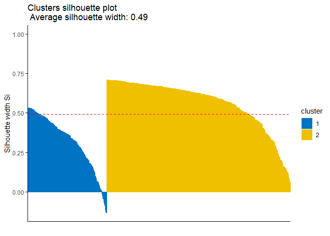
Since observations with negative silhouette value, which can be seen in the cluster 1 which is colored blue in the plot, indicate that they might be clustered wrongly. In this case you might want to reach the index numbers of those observation and analyse the issue about them. The following code might help you to get their index numbers:
sil <- k2m_data$silinfo$widths[, 1:3]
neg_sil_index <- which(sil[, 'sil_width']<0)
sil[neg_sil_index, , drop = FALSE]
##     cluster neighbor   sil_width
## 505       1        2 -0.01334316
## 224       1        2 -0.02627560
## 198       1        2 -0.04503110
## 442       1        2 -0.04567814
## 197       1        2 -0.06567648
## 331       1        2 -0.07905193
## 90        1        2 -0.08708848
## 215       1        2 -0.11522042
## 12        1        2 -0.13105913
## 376       1        2 -0.13159631
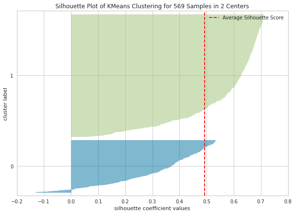
In Python, you can draw silhouette plot as follows:
from yellowbrick.cluster import silhouette_visualizer

plt.figure(figsize=(10,7))
silhouette_visualizer(kmeans2, pcadf, colors='yellowbrick')
7.5. Dunn Index
Just as CRI and MVI, you can easily calculate Dunn Index with the
function cluster.stats in the fpc package. In the code below, you
can find the code for Dunn Index calculation.
cluster.stats(dist(df), k2m_data$cluster)$dunn
## [1] 0.005768501
References for Chapter
[1] Kassambara, Alboukadel. Practical guide to cluster analysis in R: Unsupervised machine learning. Vol. 1. Sthda, 2017.
[2] Warrens, M. J., & van der Hoef, H. Understanding the rand index. In Advanced Studies in Classification and Data Science (pp. 301-313). Springer, Singapore. 2020
[3] Meilă M. “Comparing clusterings -an information based distance.” J.Multivariate Analysis, 98(5), 873-895, 2007.
8. Principle Component Analysis
Principal Component Analysis (PCA), a technique used to identify patterns in a data set, looks for directions (or “components”) that explain the most variance in the data. It decomposes the data into its components, with the first component being the direction that accounts for the most variance in the data and the second component being the direction that accounts for the second most variance in the data [1], [2]. Principal component analysis is particularly useful for large or, in other words, multivariate data sets, where complex relationships in the data set can be clarified using fewer variables. This makes the data set easier to interpret and prevents possible erroneous results that may arise from the use of fewer variables.
Earlier it was mentioned that PCA was applied before clustering the dataset. But why is this done? There are some benefits of applying PCA to a dataset before putting it into clustering algorithms. For example, in the Density Based Clustering section, we mentioned that the algorithm does not work well with high-dimensional data sets. While other algorithms are slightly better at this, high dimension is a major problem for almost every machine learning algorithm. Since PCA can be used to reduce the number of variables in a high-dimensional data set, it can help improve the performance of a clustering algorithm. In addition to dimension reduction, it can also help reduce noise and eliminate multicollinearity in the data, which can both increase the success of the clustering algorithm and make it easier to interpret[3],[4].
We can emphasize all these benefits with an example. Let’s remember the famous Iris dataset. There are 3 different labels in the dataset containing various information about iris flowers. Below you can see the scatterplot of petal and sepal lengths on the left side, while on the right side you can see the scatterplot of the Iris dataset with PCA applied. You can notice that in the Iris dataset without PCA, the two species shown in green and red overlap. On the contrary, in the dataset with PCA, you can observe that the three labels in the data are more separable (each color of the observations in the scatterplots represents a label).
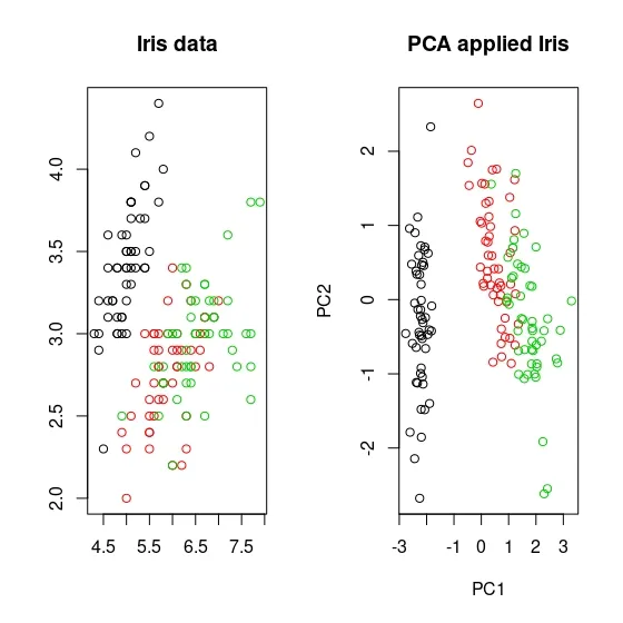
Below is a step-by-step calculation of PCA, with the first step being optional:
Step 1
The data is transformed so that each variable has a mean of zero and a standard deviation of one. This is done to ensure that all variables are on the same scale.
Step 2
Covariance matrix is calculated to determine the relationship between variables in the data set.
Step 3
Eigenvectors and eigenvalues of the covariance matrix are calculated. Eigenvectors represent the directions that explain the most variance in the data and eigenvalues represent the amount of variance explained by each eigenvector.
Step 4
Eigenvectors with the highest eigenvalues are selected as the principal components of the dataset.
Step 5
The original dataset is transformed by projecting it onto the principal components, resulting in a new dimensionality-reduced dataset.
8.1. Principle Component Analysis in R
Principle component analysis is done in stats package with the
function called prcomp.
data.pca <- prcomp(df, # data set that PCA will be applied.
                   scale. = TRUE # whether data will be standardized.
)
summary(data.pca) # to see the results.
## Importance of components:
##                           PC1    PC2     PC3    PC4     PC5     PC6     PC7
## Standard deviation     2.3406 1.5870 0.93841 0.7064 0.61036 0.35234 0.28299
## Proportion of Variance 0.5479 0.2519 0.08806 0.0499 0.03725 0.01241 0.00801
## Cumulative Proportion  0.5479 0.7997 0.88779 0.9377 0.97495 0.98736 0.99537
##                            PC8     PC9    PC10
## Standard deviation     0.18679 0.10552 0.01680
## Proportion of Variance 0.00349 0.00111 0.00003
## Cumulative Proportion  0.99886 0.99997 1.00000
This output, which contains the results obtained from the principal component analysis, contains standard deviation, proportion of variance and cumulative proportion values for each component. Standard deviation is the square root of the variance of each component. This value indicates how well the component explains the variability in the data set. For example, the standard deviation of component PC1 is 2.3406. This indicates that PC1 explains the majority of the variability in the data set. Proportion of Variance shows the share of each component in the total variance. For example, PC1 component explains 54.79% of the variance in the data set, while PC2 component explains 25.19%. Cumulative Proportion is the sum of the proportion of variance of each component. This value shows the share of all components up to that component in the total variance. For example, PC1 explains 54.79% of the total variance in the data set, while the first two components explain 79.97% of the variance in the data set.
At this point, as the analyst, we need to pay attention to how many components we plan to choose for the purpose of explaining the data set. The number of components may vary depending on the size of the data set and the purpose of the analysis. However, it is common to choose enough components to explain 70-80% of the cumulative variance of the components. In this example, choosing two components may be a good starting point as the first two components explain 79.97% of the total variance.
Another way of deciding the number of components is the Scree plot.
Scree plot is created by plotting the percentage of variance explained
for each dimension. Just like in the elbow method, an elbow is looked
for in Scree plot. The component where the elbow occurs is selected as
the optimal number of components. We can plot Scree plots using the
function fviz_eig from the factoextra package:
library(factoextra)
fviz_eig(data.pca)
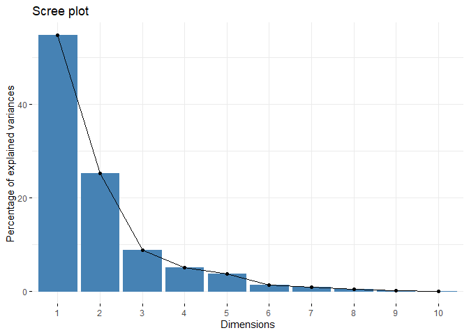
Examining the scree plot, we notice that the elbow appears in the third component. This contradicts our conclusion in the summary output. This points to the need for an analysis - which makes the data set a perfect example for a book explaining PCA. Now, let’s go deeper into PCA!
data.pca object containing PCA results, which we summarize with
summary function, stores a lot of different information. One of this
information is the rotation property. Rotation property shows the
relationship of the components to the original variables. For example,
rotation property of component 3 is a vector that shows the relationship
between each of the original variables and component 3. This vector
helps us understand the relationship of the original variables to the
principal components. Since in this example we are between 2 and 3
components, it might be useful to look at rotation values of the first
three components. To access the “rotation” property on the data.pca
object, we can use the data.pca$rotation command.
data.pca$rotation[,1:3]
##                           PC1          PC2         PC3
## radius            -0.36393793  0.313929073 -0.12442759
## texture           -0.15445113  0.147180909  0.95105659
## perimeter         -0.37604434  0.284657885 -0.11408360
## area              -0.36408585  0.304841714 -0.12337786
## smoothness        -0.23248053 -0.401962324 -0.16653247
## compactness       -0.36444206 -0.266013147  0.05827786
## concavity         -0.39574849 -0.104285968  0.04114649
## concave.points    -0.41803840 -0.007183605 -0.06855383
## symmetry          -0.21523797 -0.368300910  0.03672364
## fractal.dimension -0.07183744 -0.571767700  0.11358395
In the output above, each column contains a vector showing the relationship of the principal component with the original variables. For example, the PC1 column is a vector showing the relationship of each original variable to PC1. This relationship shows how much each original variable contributes to the principal components. For example, in the PC3 component and the variables contributing to it, we can notice that only the “texture” variable contributes to the component. Since it would be very costly and unreasonable to add components for a single variable, we can think that it would be more appropriate to choose two principle components in this dataset.
Since examining the components and variables one by one can be tedious,
it may be more useful for us to plot the rotations. With the function
fviz_contrib in the factoextra package we can plot the contribution
of the variables for each component:
fviz_contrib(data.pca,# an object of class PCA
             choice = "var", # "var" for variables, "ind" for observation
             axes = 1 # PC1
)
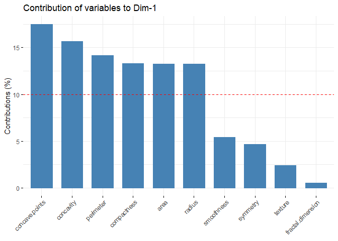
fviz_contrib(data.pca,# an object of class PCA
             choice = "var", # "var" for variables, "ind" for observation
             axes = 2 # PC2
)
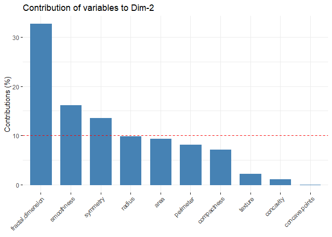
fviz_contrib(data.pca,# an object of class PCA
             choice = "var", # "var" for variables, "ind" for observation
             axes = 3 # PC3
)
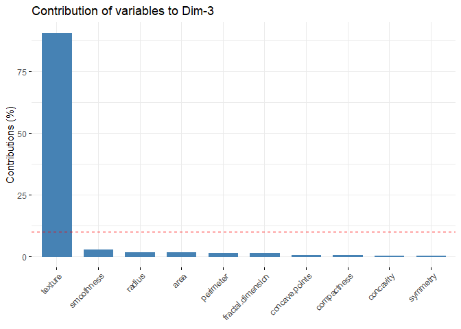
fviz_pca_ind function included in the factoextrapackage, the
contribution of each observation in the data set to the components can
be visualized.
fviz_pca_ind(data.pca,#an object of class PCA
             col.ind = "cos2",  # the colors for individuals are automatically controlled by their qualities of representation ("cos2"),
             gradient.cols = c("#00AFBB", "#E7B800", "#FC4E07"), # vector of colors to use for n-colour gradient.
             repel = F #  whether to use ggrepel to avoid overplotting text labels or not.
)
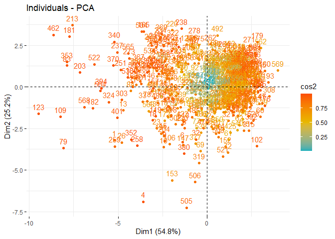
When the contributions of the observations in the PC1 and PC2 graphs are analyzed, a clustering is observed in the upper right and lower right. It can be said that these observations express similar characteristics. For example, when the values of the 79th observation at the bottom left are examined, it can be seen that it has values close to the maximum for all variables except Radius and Texture. When the 569th observation values on the opposite axis are examined, it can be seen that Smoothness and Concavity have minimum values, while Texture has a value above the 3rd quartile.
fviz_pca_var function included in the factoextrapackage, the
contribution of each variable in the data set to the components can be
visualized.
fviz_pca_var(data.pca,
             col.var = "contrib",
             gradient.cols = c("#00AFBB", "#E7B800", "#FC4E07"),
             repel = F     )
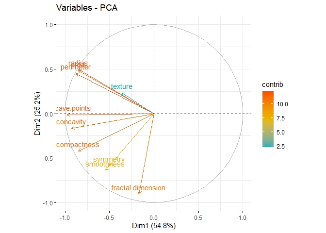
When the PCA graph of the variables is analyzed, it can be said that the variables with positive correlation point to the same regions. While Area has a positive correlation with Perimeter, which is in the same component, it has a negative correlation with fractal dimension, which is in a different component. The contributions of the variables can be better seen through this graph.
References for Chapter
[1] Bryant, F. B., & Yarnold, P. R. (1995). Principal-components analysis and exploratory and confirmatory factor analysis.
[2] James, G., Witten, D., Hastie, T., & Tibshirani, R. (2013). An introduction to statistical learning (Vol. 112, p. 18). New York: springer.
[3] Ben-Hur, Asa, and Isabelle Guyon. Detecting stable clusters using principal component analysis. Functional genomics. Humana press, 159–182, 2003.
[4] Ding, Chris, and Xiaofeng He. K-means clustering via principal component analysis. Proceedings of the twenty-first international conference on Machine learning. 2004.
8.2. Principle Component Analysis in Python
from sklearn.preprocessing import StandardScaler
from sklearn.decomposition import PCA

sdf = StandardScaler().fit_transform(df)

pca = PCA(n_components=2)
principalComponents = pca.fit_transform(sdf)

pcadf = pd.DataFrame(data = principalComponents, columns = ['PC1', 'PC2'])
Exercises
For the exercises you first need to download the Breast Tissue dataset. The dataset consists of electrical impedance measurements of breast tissue samples. There are 106 observations and 10 variables. However, one variable named Class is related to label information for classification projects. Since you will cluster the dataset, this variable must be removed from the dataset. However, you may need to use this variable to assess the validity of the clustering results. Detailed information about variables can be found at UCI Machine Learning Repository website. For the Exercises section, you need to complete the following steps:
-
Analyze and interpret the descriptive statistics of the data set.
-
Analyze the correlation of the data set.
-
Apply PCA to the data set.
-
Apply k-means to the data set.
-
Apply k-medoids to the data set.
-
Apply hierarchical clustering to the data set.
-
Apply DBSCAN to the data set.
-
Compare cluster validation metrics for all clustering algorithms and decide the best algorithm.
-
Compare and analyze the clusters resulting from the best algorithm.